
Search
Kyoto has a search panel that opens from the header and a full search results page. Search settings are in Theme settings > Search; the results page is in the theme editor under Search.
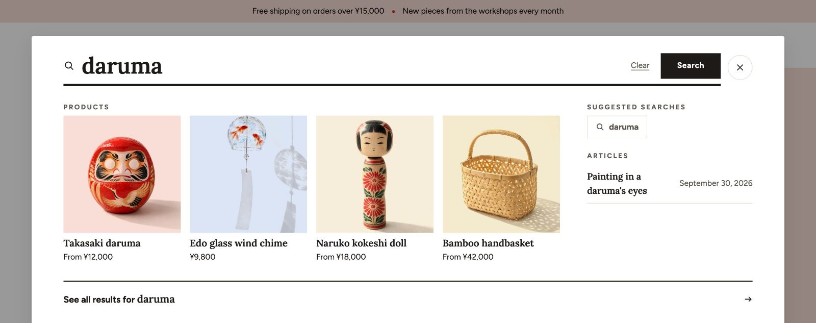
The search panel
| Setting | Choices | What it does |
|---|---|---|
| Search style | Drawer, Modal, Inline | How the search panel opens from the header. |
| Enable predictive search | On or off | Suggestions appear as shoppers type. |
| Include collections, Include pages, Include articles | On or off | What the suggestions include besides products. |
| Show price, Show vendor | On or off | What product suggestions show. |
| Popular searches menu | Menu | Links from this menu show as popular searches when the search opens. Create the menu in Online Store > Navigation. |
| Collection for no results | Collection | Products shown when a search finds nothing. |
| Show recent searches | On or off | Up to 5 terms, saved only in the shopper's browser. |
| Suggested products | Collection | Up to 4 products from this collection show when the search opens. |
| Live results for unsupported languages | On or off | See below. |
In the Header section you also choose Search on desktop (Icon or Bar) and Search on mobile (Icon or Search bar below).
Japanese, Chinese and Korean
Shopify's predictive search does not support Japanese, Chinese or Korean. On pages in these languages Kyoto uses the regular search form instead. With Live results for unsupported languages on, Kyoto shows search results under the field shortly after the shopper stops typing, so the panel still feels immediate.
Search matching itself is done by Shopify. To help shoppers find products in Japanese, include the words they are likely to type (for example both kanji and kana, or both the Japanese and the English name) in the product title, description, tags or product type.
The search results page
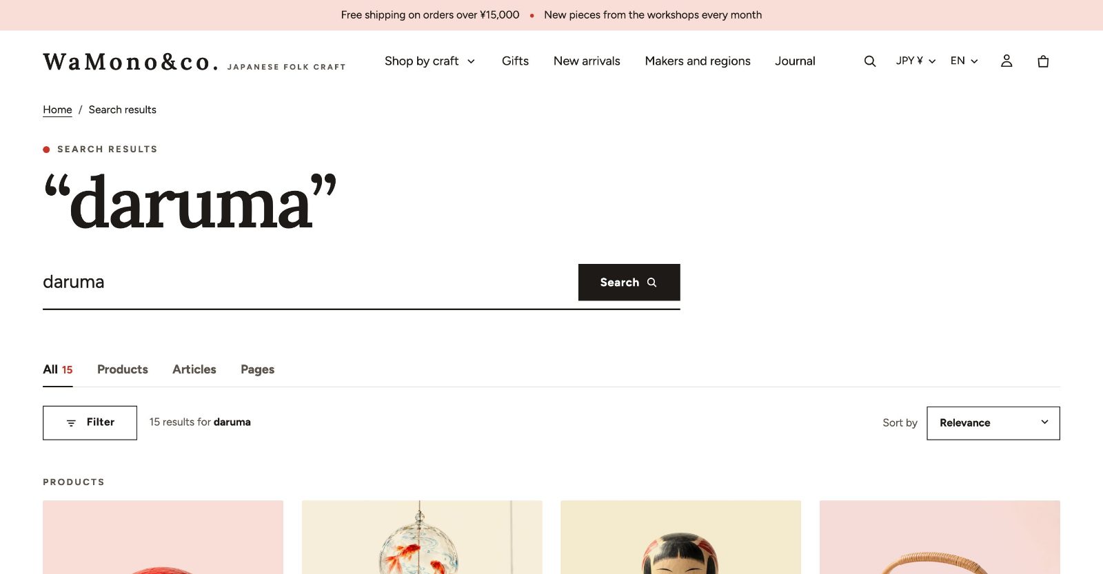
| Setting | Choices or range |
|---|---|
| Columns on desktop | 2 to 6 |
| Columns on mobile | 1, 2 |
| Products per page | 8 to 48, in steps of 4 |
| Pagination | Page numbers, Load more, Infinite scroll |
| Enable filtering, Filter layout | Sidebar, Drawer, Horizontal |
| Show filter counts, Enable sorting | On or off |
| Show result type tabs | Tabs for products, articles and pages |
| Show article images | On or off |
| Card image ratio, Card hover effect | Override the theme settings for the results |
When a search finds nothing, the page offers the products of Collection for no results and a new search.
Search look
The Search look block is always part of the Search results section. Select it in the sidebar to set the sizes of the page: Large line size (the words searched for, in the heading font: Small, Medium, Large, Extra large), Search field size, Chip size (Small, Medium, Large), Product name size (heading font) and Tile height. It can also put product pictures on pale color fields and show your collections as color tiles before a search and when nothing matches. With the Color field, label plate beside the object card style, the same Adjust the label plate card settings as in the collection's Grid look block size the result cards. All settings with their defaults are in Collection, search and list pages.