
Getting started
This page takes you from installing Kyoto to a store that is ready to publish.
1. Try or install the theme
- In your Shopify admin, go to Online Store > Themes.
- Open Kyoto in the Shopify Theme Store and choose Try theme. Kyoto is added to your theme library as an unpublished theme. Your published theme stays live.
- Open the ... menu next to Kyoto and choose Customize to open the theme editor.
- When you buy the theme, the copy in your library becomes the paid version. Publish it when you are ready.
You can try Kyoto for free in your own store before you buy it. Theme purchases are handled by Shopify; see Refunds in the FAQ.
2. The preset
Kyoto comes with one preset, also called Kyoto. A preset is a set of colors, fonts and layouts. After you install the theme, your store has the same layout, color schemes and fonts as the Kyoto demo store:
- English and other Latin text: headings in Lora, body text, prices and buttons in Figtree. Japanese text: headings in Shippori Mincho, body text in Zen Kaku Gothic New. All four come from Shopify's font library.
- A white page with pale craft color fields behind products, ink-colored square buttons and a vermilion accent for small marks such as the cart count.
- Bold motion: sections, headings and pictures animate as they come into view. You can turn this down or off in Theme settings > Motion (see Motion).
3. Demo content and your own content
The demo store shows Kyoto with real products, photos and text. When you install the theme, you get the same sections in the same order, but the demo's photos, products, collections and blog posts are not copied to your store. Shopify does not transfer demo content. Each section shows a drawn placeholder until you choose your own image, product or collection.
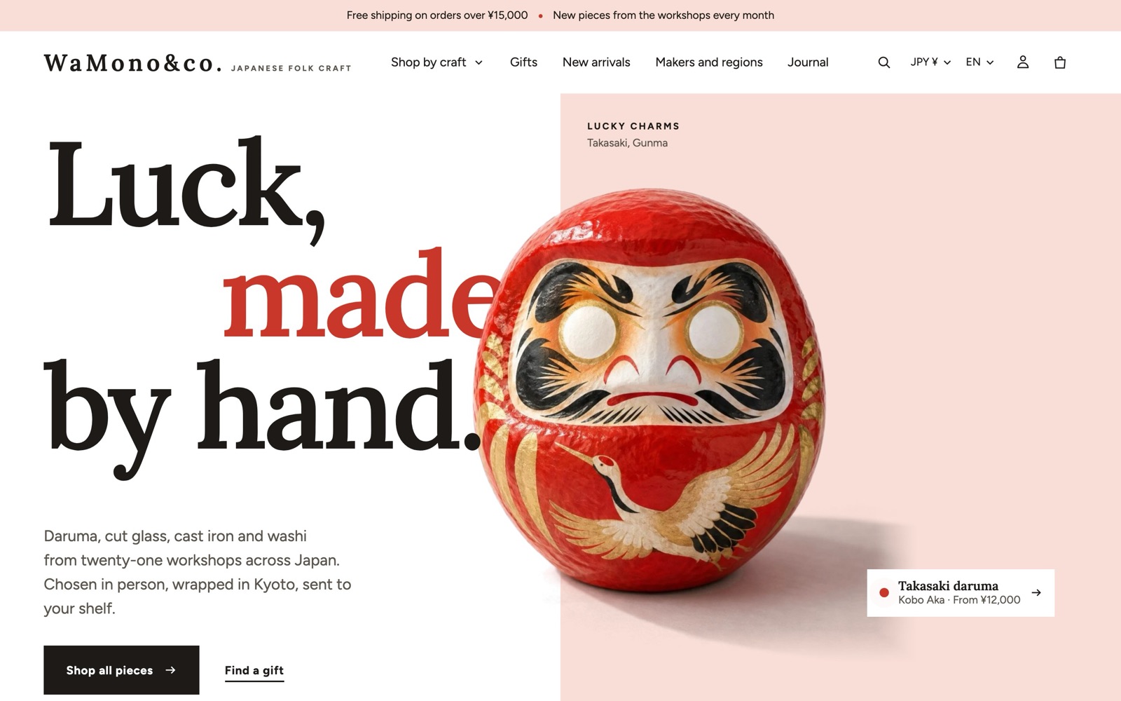
The home page starts with these sections, in this order:
- Interlocking hero
- Marquee
- Collection list (color fields)
- Product shelf
- Featured product
- Statistics
- Stacked cards
- Timeline
- Gift guide
- Testimonials
- Blog posts
- Closing band
Fill them one by one, or remove the ones you don't need. Every section can be hidden, moved or deleted, and you can add more from the 100 sections Kyoto offers (see Sections and blocks).
4. First steps in the theme editor
Work through these in order. Each step links to the page that explains it.
- Logo and favicon: Theme settings > Logo and favicon. Add your logo, an inverse logo for dark backgrounds and the favicon. Set Logo height and Logo height on mobile. See Theme settings.
- Colors: Theme settings > Colors. Change the palette to your brand colors; the 12 color schemes follow automatically. See Colors.
- Fonts: Theme settings > Typography. See Theme settings.
- Menus: create your menus in Online Store > Navigation, then choose them in the Header and Footer sections. See Header and footer.
- Free shipping: if you offer free shipping over an amount, set Free shipping minimum in Theme settings > Cart to the same amount as your shipping rate. See Cart.
- Home page: add your images, collections and products to each section.
- Product page: choose Products > Default product from the page menu at the top of the editor. See Product page.
- Metafields (optional): to show second names, makers, materials, cut-out pictures or color fields per product, create the metafields described on Metafields.
- Languages: if you sell in more than one language, see Languages.
- Check on a phone: use the phone icon at the top of the theme editor, then open the preview on a real phone.
5. Image sizes that work well
| Where | Recommended |
|---|---|
| Hero and slideshow images | 2400 px wide or more, landscape. Add a separate mobile image for tall phone screens. |
| Product photos | 2000 x 2000 px or larger, the same shape for every product. Photos on a white background work best with the color fields. |
| Cut-out pictures | .png with a transparent background, about 1600 px on the long side. See Cut-out images. |
| Collection images | 1200 x 1200 px or larger. |
| Logo | .png or .svg with a transparent background, at least twice the height you set in Logo height. |
Shopify creates smaller copies of every image for phones and tablets, so a large original never slows down a phone.
6. Before you publish
- Preview every page type: home, a collection, a product with variants, a product without images, the cart, search, a blog post and a page.
- Check the Performance tips if you added many apps.
- Read Support policy so you know where to ask for help.