
Product page
To edit the product page, open the theme editor and choose Products > Default product from the page menu at the top. Changes apply to every product that uses this template. To give some products a different layout, create another product template (Create template in the same menu) and assign it to those products in the Shopify admin.
The page has a gallery on one side and an information column on the other. Every part of the information column is a block: move it, remove it or add another. Every setting with its full range is listed in Product page sections.
Layout and gallery
In the Product information section:
| Setting | Choices | Notes |
|---|---|---|
| Layout | Image left, Image right, Wide image, Stacked | |
| Media width | 50, 55, 60, 65 (% of the page) | |
| Sticky product info | On or off | The information column stays in view while the gallery scrolls. |
| Gallery style | Thumbnails below, Thumbnails beside, Stack, Grid, Carousel, Grid with highlight, Collage, Spread (1 large, 2 small), Thumbnails below, with the product title beside the photo, Color field stage, Figure: product name under the floor line, tabs | Kyoto installs with Color field stage. Figure is described below. |
| Mobile gallery style | Carousel, Stack | With Mobile gallery controls: Dots, Counter, Thumbnails, and Peek next image on mobile. |
| Media aspect ratio | Adapt to image, Portrait, Tall, Square, Landscape, Wide | |
| Image fit | Cover, Contain, Contain, on a tinted frame | |
| Image zoom | None, Hover, Lightbox, Both | |
| Show selected variant media only | On or off | Shows only the images of the chosen variant. Assign images to variants in the Shopify admin. |
| Sticky buy bar | Off, Mobile, All | A bar with the price and the add to cart button that stays at the bottom of the screen. Sticky bar button action: Add to cart, Scroll, Bottom sheet. |
| Space between product details | Tight, Normal, Loose | |
| Space between media and details | Small, Medium, Large |
Media stage
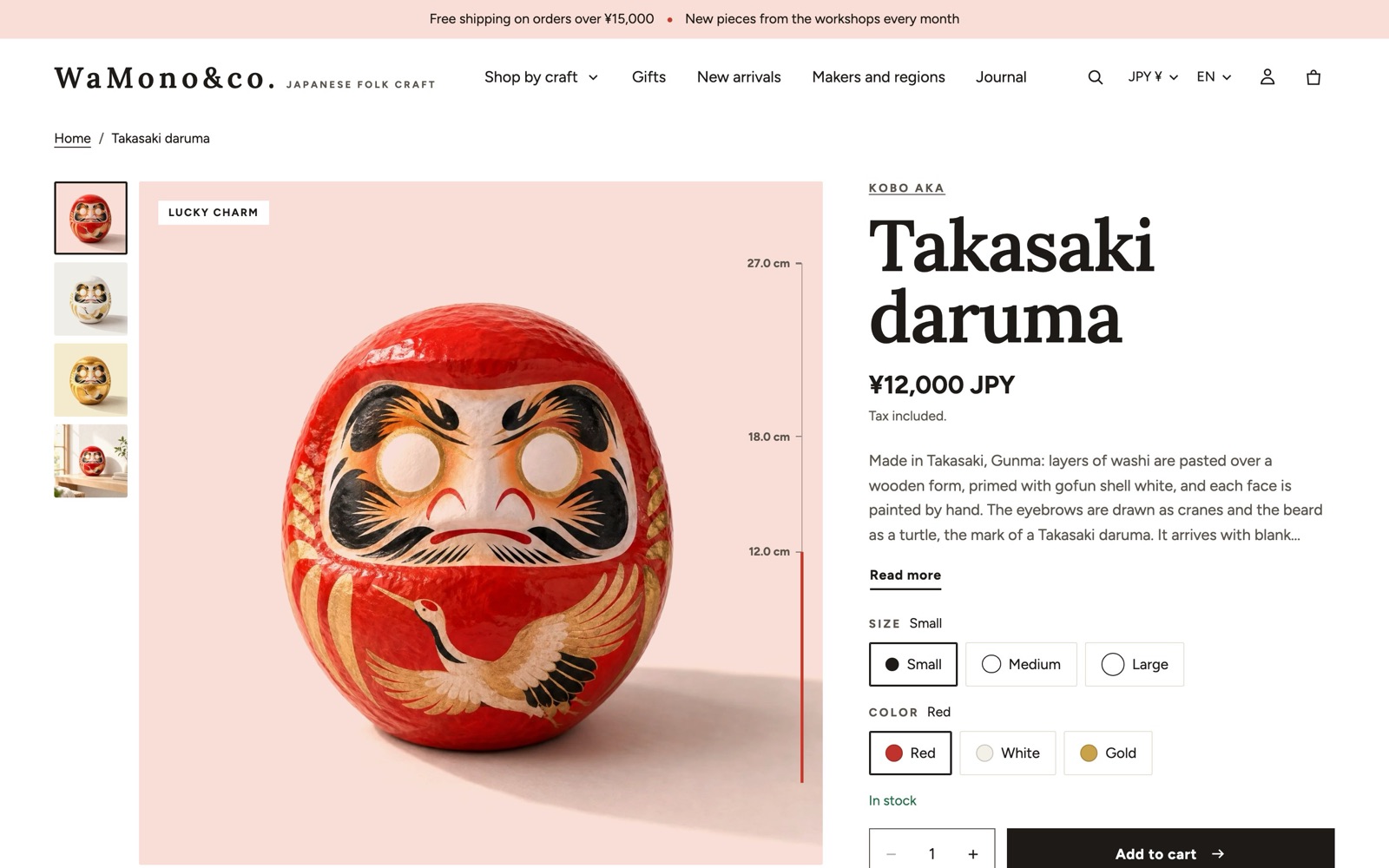
With Gallery style set to Color field stage, each product photo stands on a pale color field, like an object on a gallery plinth. When the shopper chooses another color, the field changes to match. Select the Media stage block (always present in the section) to set it up.
Color field
- Default field color: used for photos that belong to no color variant. Leave it blank to use the product's custom.field_colour metafield, then the palette's washi color.
- Color words and fields: one line per color, written
word: color, for example:indigo: #DCE5F6 moss: #E3ECD9 vermilion: #F8DED6A variant whose option value contains the word puts its photo on that color. Option swatches and the variant metafield custom.field_colour work too, so you may not need any lines at all.
- Photos: Blend white into the field (for photos taken on a white background: the white takes the field color and the shadow stays) or Normal (for scene photos).
Chips on the photo
Small labels on the photo's corner: Chip 1 and Chip 2 (short text; connect a product metafield to vary them per product), Product type as a chip and Badges as chips (sale, new, low stock and tag badges).
Sizes (turn on Adjust sizes and motion)
| Setting | Choices |
|---|---|
| Thumbnail column width | Small, Medium, Large, Extra large |
| Chip text size | Small, Medium, Large |
| Swatch strength | 10 to 60 %: how much of a swatch color goes into its field |
| Motion | None, Subtle, Bold |
The stage can also hold a Seal block (a round stamp with words around its rim) and has a vertical size ruler standing on the edge of the photo (see below).
Figure
With Gallery style set to Figure: product name under the floor line, tabs, the gallery is drawn as one exhibition plate. A single pale field holds the object, which stands on a thin floor line, with the size ruler in its own column beside it. Under the floor line sit the product name (the page's only main heading) and the maker line (vendor and the custom.made_in metafield), with the photo chips opposite. The thumbnails become a row of tabs under the field, each with a small picture and a word, such as the color of that photo. On phones the figure runs edge to edge and the tabs scroll sideways.
The figure uses the field colors and chips of the Media stage block, plus Show made in, maker and material as chips. Its sizes are in the same block, under Adjust sizes and motion:
| Setting | Choices |
|---|---|
| Object’s foot in the photo (figure) | 60 to 100 % (default 82): where the object's foot is, from the top of the photo. The photo is cut just under it, so the object stands on the floor line. Use about 82 % for photos with a soft shadow on a white ground, 100 % for cut-outs. |
| Object room shape (figure) | Square, Standard, Landscape, Wide |
| Object size (figure) | 60 to 100 % |
| Product name size under the floor line (figure) | Medium, Large, Extra large |
| Tab row height (figure) | Small, Medium, Large |
| Buy column width (figure) | Small, Medium, Large |
| Ruler column width (figure) | Small, Medium, Large |
Size ruler
The size ruler shows how big the chosen size is and moves when the shopper picks another size. It is useful for items whose size is hard to judge from a photo, such as bowls, vases or figures.
It appears in two places:
- On the media stage: a vertical ruler beside the photo (a fixed part of the stage).
- In the information column: add a Size ruler block for a horizontal scale with a read-out such as "Size 18 cm".
Settings
- Size option names: the product option that holds the size, for example
Size, サイズ. A product without that option, or with one size only, shows no ruler. - Numbers per value: one line per size, written
Value: number, for exampleMedium: 18. - Unit: the unit printed after the numbers, such as
cm. - Show the chosen size as text: the read-out above the scale.
Kyoto finds each size's number in this order: the variant metafield custom.height, a line in Numbers per value, then the number the value starts with ("18 cm"). If a size has no number at all, the ruler shows the sizes as evenly spaced steps labeled with their names (Small, Medium, Large).
Sizes (turn on Adjust sizes and motion)
| Setting | Choices |
|---|---|
| Ruler length | Small, Medium, Large, Extra large |
| Tick label size | Small, Medium, Large |
| Bar weight | Thin, Regular, Bold |
| Side of the photo | End, Start |
| Bar color | Pop, Text color, Accent |
| Motion | None, Subtle, Bold |
Museum label
The Museum label block describes the product the way a gallery labels an object: a second name, then rows for Made in, Maker, Material and Note.
Each line comes from the block setting; leave a setting blank and Kyoto reads the product metafield instead:
| Line | Block setting | Metafield used when the setting is blank |
|---|---|---|
| Second name | Second name | custom.title_ja (for example the Japanese name) |
| Made in | Made in | custom.made_in |
| Maker | Maker (with Show the maker row on) | custom.maker, then the product's vendor |
| Material | Material | custom.material |
| Note | Note | custom.note |
Rows without a value are left out, so the same block works for every product. See Metafields to create the metafields.
Sizes (turn on Adjust sizes and motion): Second name size (Small, Medium, Large, Extra large), Second name color (Pop, Text color, Muted), Text size (Small, Medium, Large), Row name column width (Small, Medium, Large), Top rule (Ink, Hairline, None) and Motion (None, Subtle).
Icons with text
The Icons with text block shows short promises with icons, such as delivery, returns or care. Add an Icon with text block inside it for each line.
| Setting | Choices |
|---|---|
| Layout | Row, Column, Grid, Inline |
| Icon size | Small, Medium, Large, Extra large |
| Text size | Small, Medium, Large |
| Spacing | Small, Medium, Large |
| Rules above and below | On or off |
Each Icon with text has an Icon (Truck, Returns, Leaf, Ruler, Care, Info, Lock, Gift, Warning, or None), or your own Image, a heading, text and a link. Its own Icon size (Use theme setting, Small, Medium, Large, Extra large) overrides the group's size for that one line.
Variant picker
| Setting | Choices | Notes |
|---|---|---|
| Style | Buttons, Dropdown, Auto, Cards | Auto uses a dropdown for an option with more than 10 values and buttons for the rest. |
| Use color swatches | On or off | Shows swatches for color options. |
| Show option name and value | On or off |
Variant cards
With Style set to Cards, every option value is a card. Cards help shoppers compare sizes or sets at a glance.
- Card layout: Inline (side by side) or Stacked (one per row).
- Size option names: options whose values get a dot that grows with the size, for example
Size, サイズ. - Small hint under the name: the variant metafield custom.size_label (for example "18 cm"), or the price when prices differ.
- Card size: Small, Medium, Large. Dot and swatch size: Small, Medium, Large.
Sold out values follow Sold out variant style in Theme settings > Inputs and variants.
Title, price and description sizes
| Block | Size settings |
|---|---|
| Product title | Size: Heading 1, Heading 2, Heading 3, Medium (between heading 2 and 3), Display. Heading element keeps the page structure correct for search engines and screen readers. |
| Price | Size: Small, Medium, Large, Extra large. Plus savings, a tax note, installments and an optional member price. |
| Description | Text size: Small, Medium, Large. Line length: Full, Medium, Narrow. Collapse long text with Lines when collapsed (3 to 12). Muted text color. |
Gift wrap on the product page
- Create a product for gift wrapping (for example "Gift wrap", with its own price) and choose it in Theme settings > Cart > Gift wrap product.
- In the information column, add a Group block, then add a Gift wrap block inside the group.
The shopper ticks the box to add the gift wrap product to the cart. Settings: Label, Show price, Show message field, Look (Plain, Boxed), Checkbox size and Text size (Small, Medium, Large), and the names saved on the order. Choose the names saved on the order before your first order: apps and order exports look for these exact words.
The same gift wrap product can also be added from the cart. See Cart.
Other blocks
| Block | What it does |
|---|---|
| Vendor | The brand, optionally linked to all its products. |
| Rating | Stars and count from a reviews app. |
| Badges | Sale, new, low stock and tag badges. |
| Sibling products | Links to related products shown as swatches, for example the same bowl in other glazes sold as separate products. |
| Purchase options | Subscription plans from a subscription app. |
| Inventory status | Low stock or in stock, with Low stock threshold (1 to 20), a stock count, an indicator (Text, Bar, Dot) and the restock date. |
| Buy buttons | Quantity, add to cart, dynamic checkout buttons, gift card recipient form, volume pricing, pickup availability, and a Show back in stock form that sends you a message through your store's contact form when a sold out variant is requested. Includes the free shipping progress. |
| Delivery estimate | An estimated delivery window counted in business days (Earliest (business days) 0 to 30, Latest (business days) 0 to 60), with a same-day cutoff hour, weekends and Closed dates skipped. |
| Accordion and Collapsible row | Care, materials, shipping and returns, each from text or a page. |
| Pop-up | A link or button that opens a page in a dialog, such as a size chart. It can sit next to an option, for example next to Size. |
| Specifications | A table of spec rows, optionally with SKU and barcode. |
| Custom field | A field the shopper fills in before adding to cart: text, a choice, a checkbox, a date or a noshi. It is saved with the order item. |
| Share | Share links for Facebook, X, Pinterest and LINE. |
| Complementary products | Products to buy together, from the Search & Discovery app. |
| Group | Holds other blocks in a row or column. Also the place for Rating scale, Gift wrap, Inquiry form, Offers, Collection links and Disclosure. |
Cut-out images
Some Kyoto sections let a product stand freely on a color field: the Product shelf section, the Color field with a shelf collection banner, the Interlocking hero, Hero: round window, Image with text and the Closing band. They look best with a cut-out picture: a .png with a transparent background.
- Make the cut-out with any background removal tool, export it as .png and keep a soft shadow if you like.
- Leave a little empty space around the object and keep the long side at about 1600 px.
- The Product shelf section and the Color field with a shelf collection banner read the product metafield custom.cutout (type File, images only) by themselves, so one upload per product is enough there. The other sections take the cut-out in their own image setting. See Metafields.
Sections under the product
| Section | What it does |
|---|---|
| Product details | Long facts in full width: detail rows, spec tables, nutrition facts and how to use, each able to read product metafields. |
| Complementary products | Products you paired in the Search & Discovery app. |
| Product recommendations | Related or complementary products from Shopify, or a collection. |
| Product rows | More from this brand or this collection. |
| Related articles | Articles that match the product by tag, product type or collection handle, or articles you pick. |
| Reviews | A place for your reviews app, with a rating summary. |
| Quick order list | A wholesale table with a quantity for every variant. |
| Recently viewed | The products the shopper looked at, saved only in their browser. |