
Opening sections and banners
Large first-screen sections for the home page or a landing page. Any of them can also be added further down a page as a banner.
Every size setting is listed with its full range or its choices and the default. A dagger (†) marks a setting that appears only after you choose a related option. “Other settings” lists the remaining options by their name in the theme editor.
Heroes
Hero
A large first picture, video or plain color with text and buttons over it or beside it. Further down a page it works as an image banner.
Ready-made versions when you add it: Hero: image, Hero: video, Hero: split, Hero: caption column, Image banner.
Sizes and layout
- Media width †: 50, 55, 60, 65 (default 50).
- Height: Small, Medium, Large, Full screen, Adapt to image (default Large).
- Height on mobile: Small, Medium, Large, Full screen, Adapt to image (default Medium).
- Content width: Narrow, Normal, Wide (default Normal).
- Overlay opacity †: 0 to 80 %, in steps of 5 (default 20).
Other settings: Media type, Image, Mobile image, Video, Mobile video, Show sound button, Layout, Content position, Content position on mobile, Overlay style, Show scroll arrow, Scroll effect.
Also has the standard section settings.
Blocks you can add
- Text (shared block, see Shared blocks)
- Buttons (shared block, see Shared blocks)
- Countdown (shared block, see Shared blocks)
- App blocks from apps you install
- Cover contents block
- Other settings: List new arrivals as chapter 00, Show count.
Interlocking hero
A headline of a few very large lines that locks into a cut-out product photo: each line can pass in front of the object or behind it.
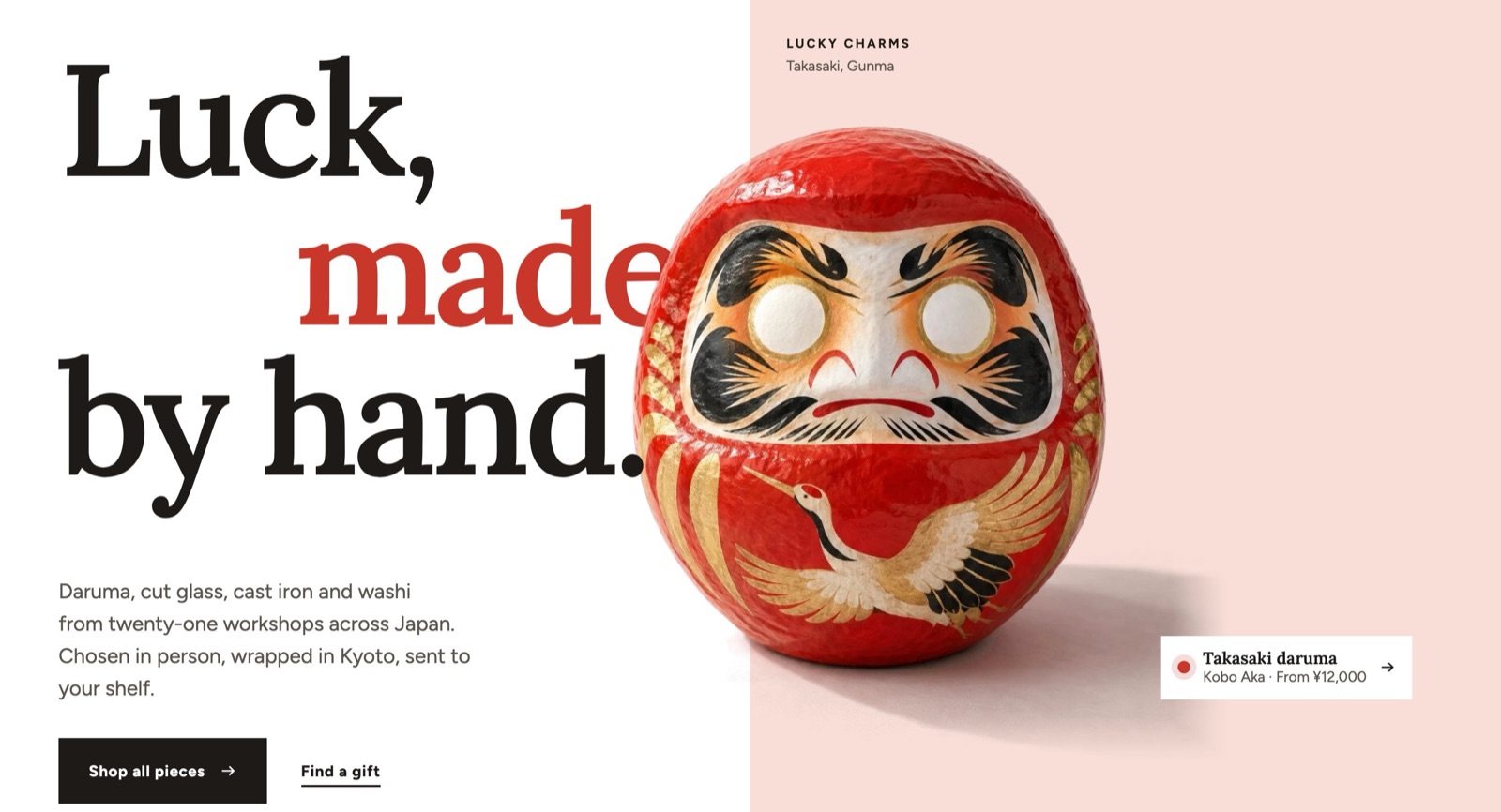
Sizes and layout
- Heading size: Small, Medium, Large, Extra large, Extra extra large, Maximum (default Extra large).
- Object size: 24 to 60 % (default 40).
- Object position across †: 40 to 90 % (default 62).
- Object lift †: 0 to 30 % (default 6).
- Object center correction †: −20 to 20 % (default 0). Moves the picture sideways by a share of its width, at every screen size. Use it when the cut-out has a shadow on one side, so the object itself, not its picture box, looks centered: a shadow on the right needs a positive value.
- Color field width †: 30 to 70 % (default 50).
- Text width †: 16 to 40 em (default 26).
- Button size †: Small, Medium, Large (default Large).
Other settings: Text, Button label, Button link, Link label, Text link destination, Cut-out image, Product, Color field, Color field label, Color field caption, Accent color, Object entrance, Scroll-out drift.
Also has the standard section settings.
Blocks you can add
- Headline line block
- Indent: 0 to 60 % (default 0).
- Other settings: Text, Pass behind the object, Accent color.
- Seal (shared block, see Shared blocks)
Fixed blocks (always part of the section; select them in the sidebar to change them)
- Object on phones block
- Horizontal position: 20 to 80 % (default 50). Center of the object across the color field: 50 is the middle, higher moves it toward the end. For a cut-out with a shadow on one side, set the section's "Object center correction" first.
- Lift from the bottom: 0 to 30 % (default 0).
- Size: 40 to 100 %, in steps of 2 (default 76).
Hero: round window
A first screen told through a round window: the words on one side, a photo in a round window on the other, with an optional cut-out object and seal.
Sizes and layout
- Heading size: Small, Medium, Large, Extra large (default Large).
- Window size (% of the row): 30 to 60 % (default 42).
- Window size on phones (%) †: 60 to 100 %, in steps of 2 (default 88).
- Text width †: 280 to 720 px, in steps of 20 (default 460).
- Space between window and ring †: 0 to 64 px, in steps of 2 (default 26). 0 hides the ring.
- Object size (% of the window) †: 15 to 70 % (default 38).
- Object reach past the window side (%) †: −30 to 50 % (default 13).
- Object reach below the window (%) †: −30 to 50 % (default 9).
Other settings: Window image, Cut-out object, Label, Small Japanese label, Heading, Accent words after the heading, Text, Window position, How the window opens.
Also has the standard section settings.
Blocks you can add
- Seal (shared block, see Shared blocks)
Fixed blocks (always part of the section; select them in the sidebar to change them)
- Buttons (shared block, see Shared blocks)
Hero with links
The first screen as a table of contents: large links to collections or features with a picture behind them that changes with the link being pointed at.
Sizes and layout
- Height: Small, Medium, Large, Full screen (default Full screen).
- Text size: Medium, Large, Extra large (default Extra large).
- Overlay opacity †: 0 to 80 %, in steps of 5 (default 30).
Other settings: Content position, Switch images on, Image behavior, Transition.
Also has the standard section settings.
Blocks you can add
- Link block
- Other settings: Heading, Text, Link, Image, Mobile image.
Slideshow
Several key images in one frame, one at a time.
Ready-made versions when you add it: Slideshow, Slideshow: cover, Slideshow: page width.
Sizes and layout
- Height: Small, Medium, Large, Full screen, Adapt to image (default Large).
- Height on mobile: Small, Medium, Large, Full screen, Adapt to image (default Medium).
Other settings: Autoplay, Autoplay interval, Transition, Controls, Slide direction, Same text on all slides, Slide layout.
Also has the standard section settings.
Blocks you can add
- Slide block
- Overlay opacity: 0 to 80 %, in steps of 5 (default 20).
- Other settings: Media type, Image, Mobile image, Video, Heading, Text, Link, Button label, Content position, Product, Mobile video.
Scrolling media
One full-width image or video that answers the scroll: it opens up, settles from a closer view or moves slightly slower than the page.
Sizes and layout
- Height: Medium, Large, Full screen (default Full screen).
- Overlay opacity: 0 to 80 %, in steps of 5 (default 30).
Other settings: Media type, Image, Mobile image, Video, Scroll effect, Content position.
Also has the standard section settings.
Blocks you can add
- Text (shared block, see Shared blocks)
- Buttons (shared block, see Shared blocks)
Large type and closing bands
Large text
One line of very large type across the whole width: a slogan, the shop name or the logo.
Ready-made versions when you add it: Large text, Large logo, Footer shop name.
Sizes and layout
- Text size †: Large, Extra large (default Extra large).
Other settings: Content type, Heading, Fit to width, Text fill, Image, Alignment, Large text motion.
Also has the standard section settings.
Closing band
One bold band near the end of a page: a large heading, a short line and an email signup or a button, with up to three objects rising from the bottom edge.
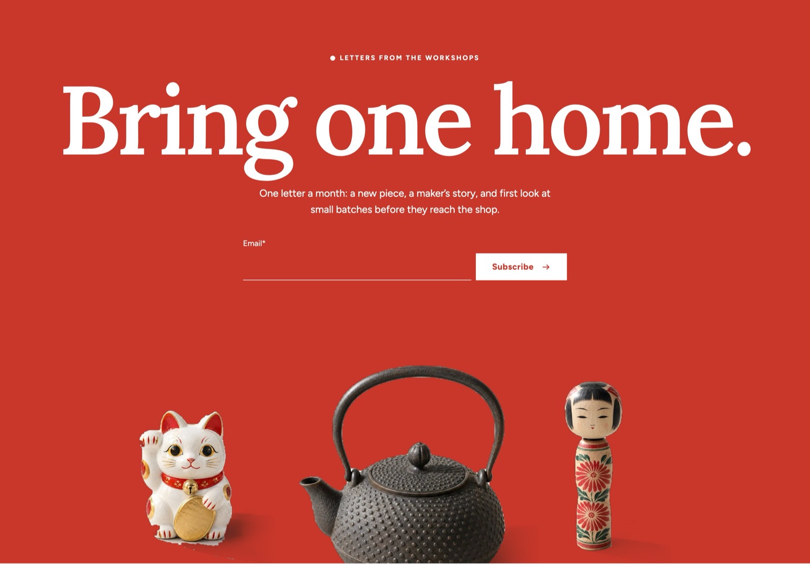
Sizes and layout
- Heading size (largest): 40 to 240 px, in steps of 4 (default 200).
- Text size: 14 to 26 px (default 18).
- Object height †: 120 to 640 px, in steps of 10 (default 440).
- Smallest band height: 0 to 100 %, in steps of 5 (default 0). In % of the screen height. 0 fits the content.
Other settings: Text above heading, Heading, Text, Under the heading, Button label, Link, Consent text, Object 1, Object 2 (middle, tallest), Object 3, Objects rise from the bottom edge.
Also has the standard section settings.
Issue cover
Announces this month's feature or a seasonal catalog with three covers stacked like magazines on a table.
Ready-made versions when you add it: Issue cover, Seasonal catalog.
Other settings: Text above heading, Product, Front cover, Second cover, Third cover, Issue number, Heading, Text, Button label, Link, Layout, Show the price.
Also has the standard section settings.