
Product and collection sections
Sections that show your products and collections on the home page or any other page.
Every size setting is listed with its full range or its choices and the default. A dagger (†) marks a setting that appears only after you choose a related option. “Other settings” lists the remaining options by their name in the theme editor.
Collections
Collection list
Entrances to your collections: color fields, round windows, grid, carousel, bento, large links and more.
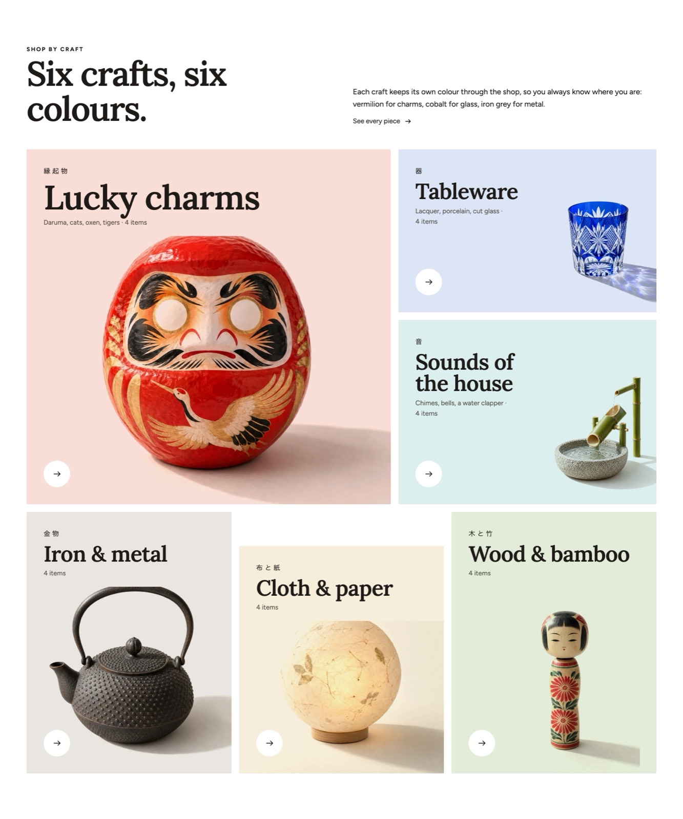
Ready-made versions when you add it: Collections: color fields, Collections: windows, Collection list: grid, Collection list: bento, Collections: large names, Collection list: icons.
Sizes and layout
- Columns on desktop: 2 to 6 (default 3).
- Columns on mobile: 1, 2 (default 2).
- Collection card image ratio: Use theme setting, Adapt to image, Portrait, Tall, Square, Landscape, Wide, Vertical (default Use theme setting).
- Name size †: Small, Medium, Large, Extra large (default Medium).
- Tile spacing †: 0 to 48 px, in steps of 2 (default 16).
- Picture scale †: 70 to 130 %, in steps of 5 (default 100).
- Tile height †: 60 to 140 %, in steps of 5 (default 100).
- Wave offset †: 0 to 120 px, in steps of 4 (default 48).
Other settings: Layout, Mobile layout, Controls, Collection card style, Show product count, Collections.
Also has the standard section settings.
Blocks you can add
- Collection block
- Other settings: Collection, Image, Name, Text, Small line.
Fixed blocks (always part of the section; select them in the sidebar to change them)
- Section heading (shared block, see Shared blocks)
Collection tabs
Several collections in one frame, switched with tabs (for example New, Popular, Gifts).
Sizes and layout
- Columns on desktop: 2 to 6 (default 4).
- Columns on mobile: 1, 2 (default 2).
- Card image ratio: Use theme setting, Adapt to image, Portrait, Tall, Square, Landscape, Wide (default Use theme setting).
Other settings: Number to show, Layout, Mobile layout, Controls, Tab style, Content alignment, Show view all link, Card hover effect, Text position.
Also has the standard section settings.
Blocks you can add
- Collection tab block
- Other settings: Label, Collection.
Fixed blocks (always part of the section; select them in the sidebar to change them)
- Section heading (shared block, see Shared blocks)
Category index
A panel of category tiles, each with a large word, a small second line and a drawing or photo.
Sizes and layout
- Columns on desktop: 3 to 8 (default 6).
- Columns on mobile: 2 to 4 (default 3).
- Tile style: Ruled grid, Panel, Plain (default Ruled grid).
- Picture size: Small, Medium, Large (default Medium).
Other settings: Order, Show the number of products.
Also has the standard section settings.
Blocks you can add
- Category tile block
- Other settings: Collection, Large word, Small line, Drawing or photo, Link.
Fixed blocks (always part of the section; select them in the sidebar to change them)
- Section heading (shared block, see Shared blocks)
Brand index
An A to Z index of every brand (vendor) you carry, with optional featured brands.
Ready-made versions when you add it: Brand index, Brand index: featured.
Sizes and layout
- Columns on desktop: 2 to 6 (default 4).
- Columns on mobile: 1, 2 (default 2).
- Featured brands per row (desktop): 2 to 4 (default 4).
Other settings: Index, Show a field to find a brand, Keep the index bar on screen, Show initials without brands, Name readings, Brands to hide.
Also has the standard section settings.
Blocks you can add
- Featured brand block
- Other settings: Brand (vendor), Logo, Image, Text, Link.
Fixed blocks (always part of the section; select them in the sidebar to change them)
- Section heading (shared block, see Shared blocks)
Tag links
A row of tag chips. Each opens the products or articles with that tag.
Ready-made versions when you add it: Tag links, Tag links: collection.
Other settings: Source, Collection, Blog, Number to show, Tags to hide, Tag style, Layout, Content alignment.
Also has the standard section settings.
Blocks you can add
- Tag block
- Other settings: Product tag, Text on the chip, Link.
Fixed blocks (always part of the section; select them in the sidebar to change them)
- Section heading (shared block, see Shared blocks)
Seasonal chapters
Your year in chapters: each chapter has a start day, a short line, an image and a collection. The current chapter can come first automatically.
Other settings: Put the current chapter first, Show the chapter contents, Products per chapter, Text direction.
Also has the standard section settings.
Blocks you can add
- Chapter block
- Other settings: Chapter name, Start day, Text, Image, Collection.
Fixed blocks (always part of the section; select them in the sidebar to change them)
- Section heading (shared block, see Shared blocks)
Products
Featured collection
A collection, or products picked by hand, as a grid, a carousel, an editorial grid or rows.
Ready-made versions when you add it: Featured collection: grid, Collection carousel, Collection: editorial.
Sizes and layout
- Columns on desktop: 2 to 6 (default 4).
- Columns on mobile: 1, 2 (default 2).
- Card image ratio: Use theme setting, Adapt to image, Portrait, Tall, Square, Landscape, Wide (default Use theme setting).
Other settings: Collection, Products, Number to show, Layout, Mobile layout, Controls, Show view all link, Show description, Card hover effect.
Also has the standard section settings.
Blocks you can add
- App blocks from apps you install
Fixed blocks (always part of the section; select them in the sidebar to change them)
- Section heading (shared block, see Shared blocks)
Featured product
One product with its gallery, price, variant picker and buy buttons, so it can be bought without leaving the page.
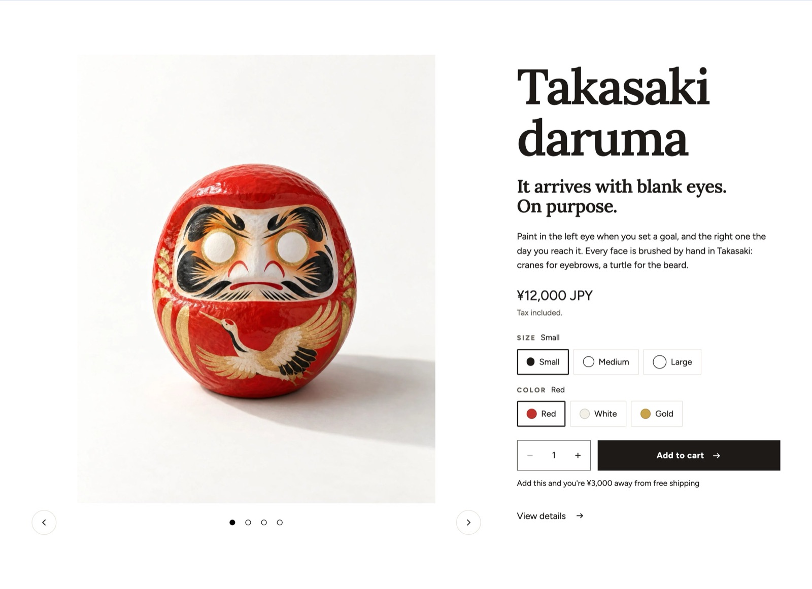
Sizes and layout
- Media width: 50, 55, 60, 65 (default 50).
- Media aspect ratio: Adapt to image, Portrait, Tall, Square, Landscape, Wide (default Adapt to image).
- Heading size: Heading 2, Heading 1, Display (default Heading 2).
Other settings: Product, Layout, Gallery style, Image fit, Image zoom, Loop video, Sticky product info, Show view details link.
Also has the standard section settings.
Blocks you can add
- Product title block
- Size: Heading 1, Heading 2, Heading 3, Medium (between heading 2 and 3), Display (default Medium (between heading 2 and 3)).
- Other settings: Heading element.
- Vendor block
- Other settings: Link to vendor.
- Price block
- Size: Small, Medium, Large, Extra large (default Medium).
- Other settings: Show savings, Label compare-at price, Show tax note, Show installments, Show member price, Member price label, Member price value, Show member price to, Message for guests.
- Rating block
- Other settings: Show count.
- Variant picker block
- Card size †: Small, Medium, Large (default Medium).
- Dot and swatch size †: Small, Medium, Large (default Medium).
- Other settings: Style, Use color swatches, Show option name and value, Card layout, Size option names, Small hint under the name.
- Buy buttons block
- Width †: Full, Auto (default Full).
- Other settings: Show quantity selector, Quantity and button on one line, Show dynamic checkout buttons, Show gift card recipient form, Show volume pricing, Show back in stock form, Show pickup availability, Show more settings, Pre-order note, Show payment icons.
- Free shipping progress block (fixed, always inside)
- Other settings: Style.
- Description block
- Lines when collapsed †: 3 to 12 (default 6).
- Text size: Small, Medium, Large (default Medium).
- Line length: Full, Medium, Narrow (default Full).
- Other settings: Collapse long text, Muted text color.
- Inventory status block
- Other settings: Low stock threshold, Show in stock status, Show stock count, Stock indicator, Show restock date.
- Text (shared block, see Shared blocks)
- Countdown (shared block, see Shared blocks)
- Icons with text block
- Icon size: Small, Medium, Large, Extra large (default Medium).
- Text size: Small, Medium, Large (default Medium).
- Spacing: Small, Medium, Large (default Medium).
- Other settings: Layout, Rules above and below.
- Icon with text block
- Icon size: Use theme setting, Small, Medium, Large, Extra large (default Use theme setting). Leave on the theme setting to use the size of the icon set.
- Other settings: Icon, Image, Heading, Text, Link.
- Custom liquid (shared block, see Shared blocks)
- Group block
- Spacing: 0 to 48 px, in steps of 4 (default 12).
- Other settings: Direction, Add border.
- Badges block
- Other settings: Maximum badges, Include tag badges.
- Sibling products block
- Other settings: Products, Label, Swatch source, Show current product name.
- Purchase options block
- Other settings: Show plan details, Show savings badge, Terms, Terms page.
- Delivery estimate block
- Other settings: Earliest (business days), Latest (business days), Show cutoff time, Same-day cutoff hour, Skip weekends, Closed dates, Replacement text.
- Accordion block
- Other settings: Style, Open first row, Open one at a time.
- Collapsible row block
- Other settings: Heading, Icon, Content, Page.
- Pop-up block
- Other settings: Label, Icon, Page, Content, Style, Open as, Show next to option.
- Text (shared block, see Shared blocks)
- Specifications block
- Other settings: Heading, Style, SKU rows.
- Spec row block
- Other settings: Label, Value.
- Custom field block
- Other settings: Field type, Label, Options, Required, Maximum characters, Help text, Value saved on the order: checked, Name saved on the order: noshi, Name saved on the order: name on noshi.
- Share block
- Other settings: Label, Show Facebook, Show X, Show Pinterest, Show LINE.
- Complementary products block
- Other settings: Heading, Number to show, Layout, Show quick add.
- Countdown (shared block, see Shared blocks)
- Custom liquid (shared block, see Shared blocks)
- Rating scale block
- Scale style: Dots, Bar, Segments (default Dots).
- Other settings: Heading, Marker animation.
- Scale row block
- Other settings: Label, Value, Left end label, Right end label.
- Gift wrap block
- Checkbox size: Small, Medium, Large (default Medium).
- Text size: Small, Medium, Large (default Medium).
- Other settings: Label, Show price, Show message field, Name saved on the order: gift wrap, Value saved on the order: gift wrap, Name saved on the order: gift message, Look.
- Inquiry form block
- Other settings: Label, Display, Show quantity field, Show phone field, Hide buy buttons on quote-only products.
- Offers block
- Other settings: Offer 1, Offer 2, Offer 3, Discount code, End date and time, Icon.
- Collection links block
- Other settings: Source, Number to show, Label, Collections.
- Disclosure block
- Other settings: Icon, Text, Link, Style.
- Sticker (shared block, see Shared blocks)
- Image (shared block, see Shared blocks)
- Video (shared block, see Shared blocks)
- Buttons (shared block, see Shared blocks)
- Email signup (shared block, see Shared blocks)
- Spacer (shared block, see Shared blocks)
- App blocks from apps you install
- Also takes these blocks, described above: Product title, Vendor, Price, Rating, Variant picker, Inventory status, Buy buttons, Description, Icons with text.
- App blocks from apps you install
Product shelf
Pieces standing on one long shelf. On wide screens the shelf slides sideways while the page scrolls and the background takes the color of the piece in the middle.
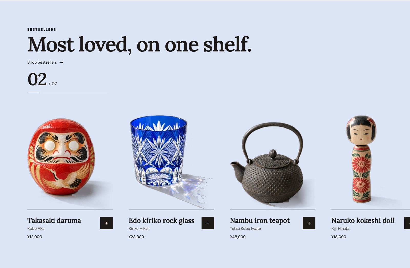
Sizes and layout
- Piece width: 200 to 440 px, in steps of 10 (default 300).
- Name size: Small, Medium, Large, Extra large (default Medium).
- Piece spacing †: 16 to 120 px, in steps of 4 (default 56).
- Stage height †: 36 to 70 % (default 54). Held layout only, % of the screen height.
- Hold length †: 50 to 200 %, in steps of 10 (default 100). 100%: one step of scroll moves the row one step. More: the row moves slower.
Other settings: Collection, Products, Number to show, Hold and slide on scroll, Background follows the piece in the middle, Counter and progress line, Show vendor, Show quick add.
Also has the standard section settings.
Blocks you can add
- Shelf piece block
- Other settings: Product, Cut-out image.
Fixed blocks (always part of the section; select them in the sidebar to change them)
- Section heading (shared block, see Shared blocks)
Ranking
A ranking with large numbers. The order is the collection's own order, which you set by sorting the collection manually in the Shopify admin.
Sizes and layout
- Large places: 1, 3 (default 3).
- Columns of the smaller rows (desktop): 1, 2 (default 2).
- Card image ratio: Use theme setting, Adapt to image, Portrait, Tall, Square, Landscape, Wide (default Use theme setting).
Other settings: Collections, Places to show, Show view all link, Card hover effect.
Also has the standard section settings.
Blocks you can add
- App blocks from apps you install
Fixed blocks (always part of the section; select them in the sidebar to change them)
- Section heading (shared block, see Shared blocks)
Recently viewed
The products this shopper looked at, saved only in their browser.
Sizes and layout
- Columns on desktop: 2 to 6 (default 4).
- Columns on mobile: 1, 2 (default 2).
- Card image ratio: Use theme setting, Adapt to image, Portrait, Tall, Square, Landscape, Wide (default Use theme setting).
Other settings: Number to show, Layout, Mobile layout, Controls, Show clear history button, Card hover effect.
Also has the standard section settings.
Blocks you can add
- Custom liquid (shared block, see Shared blocks)
- App blocks from apps you install
Fixed blocks (always part of the section; select them in the sidebar to change them)
- Section heading (shared block, see Shared blocks)
Product bundle
A fixed set of two to five products with one “Add the set to cart” button.
Other settings: Include current product, Layout, Show variant selectors, Discount note.
Also has the standard section settings.
Blocks you can add
- Bundle product block
- Other settings: Product, Checked by default.
Fixed blocks (always part of the section; select them in the sidebar to change them)
- Section heading (shared block, see Shared blocks)
Price breakdown
Shows what a product's price is made of, using only the amounts you enter.
Other settings: Product, Display style, Comparison label, Comparison price, Note, Count up numbers.
Also has the standard section settings.
Blocks you can add
- Cost item block
- Other settings: Label, Amount, Text, Color.
Fixed blocks (always part of the section; select them in the sidebar to change them)
- Section heading (shared block, see Shared blocks)
Product highlight
One product image in the middle with its features placed around it.
Other settings: Product, Image, Layout, Show connector lines, Show product info.
Also has the standard section settings.
Blocks you can add
- Highlight point block
- Horizontal position: 0 to 100 % (default 50).
- Vertical position: 0 to 100 % (default 50).
- Other settings: Icon, Heading, Text.
Fixed blocks (always part of the section; select them in the sidebar to change them)
- Section heading (shared block, see Shared blocks)
Shop the look
Media with products
A large photo or video of products in use, with the products listed beside it as cards.
Ready-made versions when you add it: Image with products, Video with products.
Sizes and layout
- Media aspect ratio: Adapt to image, Portrait, Tall, Square, Landscape, Wide, Vertical (default Portrait).
Other settings: Media type, Image, Video, Media position, Products layout, Products.
Also has the standard section settings.
Fixed blocks (always part of the section; select them in the sidebar to change them)
- Section heading (shared block, see Shared blocks)
Lookbook
Several looks (a table setting, a room), each leading to its products.
Ready-made versions when you add it: Lookbook, Styling.
Sizes and layout
- Columns on desktop: 1 to 4 (default 2).
- Media aspect ratio: Adapt to image, Portrait, Tall, Square, Landscape, Wide, Vertical (default Portrait).
Other settings: Layout, Controls, Products display.
Also has the standard section settings.
Blocks you can add
- Look block
- Other settings: Image, Heading, Text, Link, Button label, Products.
- Hotspot block
- Horizontal position: 0 to 100 % (default 50).
- Vertical position: 0 to 100 % (default 50).
- Horizontal position on mobile †: 0 to 100 % (default 50).
- Vertical position on mobile †: 0 to 100 % (default 50).
- Other settings: Product, Custom position on mobile, Heading, Text.
Fixed blocks (always part of the section; select them in the sidebar to change them)
- Section heading (shared block, see Shared blocks)
Hotspots
One styling photo with points on it. Each point opens the product in the picture.
Sizes and layout
- Media aspect ratio: Adapt to image, Portrait, Tall, Square, Landscape, Wide, Vertical (default Adapt to image).
Other settings: Image, Mobile image, Layout, Media position, Hotspot style.
Also has the standard section settings.
Blocks you can add
- Hotspot block
- Horizontal position: 0 to 100 % (default 50).
- Vertical position: 0 to 100 % (default 50).
- Horizontal position on mobile †: 0 to 100 % (default 50).
- Vertical position on mobile †: 0 to 100 % (default 50).
- Other settings: Product, Custom position on mobile, Heading, Text.
Fixed blocks (always part of the section; select them in the sidebar to change them)
- Section heading (shared block, see Shared blocks)
Styling
Looks put together from your goods in tall photos. Pressing a look shows its products.
Sizes and layout
- Columns on desktop: 2 to 4 (default 4).
- Columns on mobile: 1, 2 (default 2).
Other settings: Photo shape, Show the products, Show the number of items.
Also has the standard section settings.
Blocks you can add
- Look block
- Other settings: Image, Name, Short text, Products.
Fixed blocks (always part of the section; select them in the sidebar to change them)
- Section heading (shared block, see Shared blocks)
Shoppable videos
Short vertical videos, each with the product it shows.
Sizes and layout
- Columns on desktop: 2 to 6 (default 4).
- Media aspect ratio: Vertical, Portrait, Square (default Vertical).
Other settings: Layout, Autoplay, Show product card, Open in viewer, Controls.
Also has the standard section settings.
Blocks you can add
- Video block
- Other settings: Video, Product, Caption, Disclosure label.
Fixed blocks (always part of the section; select them in the sidebar to change them)
- Section heading (shared block, see Shared blocks)
Staff picks
Products picked by your staff or makers, each with a photo, a name and a short comment, plus a disclosure label.
Sizes and layout
- Columns on desktop: 2 to 4 (default 3).
Other settings: Layout, Mobile layout, Comment style.
Also has the standard section settings.
Blocks you can add
- Staff pick block
- Other settings: Product, Comment, Author, Author details, Author photo, Disclosure label.
Fixed blocks (always part of the section; select them in the sidebar to change them)
- Section heading (shared block, see Shared blocks)
Promotions, gifts and offers
Promo grid
Entrances to sales, features and new arrivals as a grid of large and small tiles, each with an image or video, text and a link.
Ready-made versions when you add it: Promo grid, Contents.
Sizes and layout
- Height †: Small, Medium, Large (default Medium).
Other settings: Layout, Mobile layout, Controls.
Also has the standard section settings.
Blocks you can add
- Promo tile block
- Column span †: 1, 2 (default 1).
- Overlay opacity †: 0 to 80 %, in steps of 5 (default 20).
- Tile size: Auto, Large, Tall, Wide (default Auto). Used by the Contents and bento grids. Tall fits a 9:16 video.
- Other settings: Media type, Image, Video, Heading, Text, Link, Button label, Position in grid, Show more settings, Content position, Hide when filtered, Product, Collection, Article.
Fixed blocks (always part of the section; select them in the sidebar to change them)
- Section heading (shared block, see Shared blocks)
Gift guide
Explains your gift options (wrapping, noshi, messages) or lets shoppers choose gifts by budget.
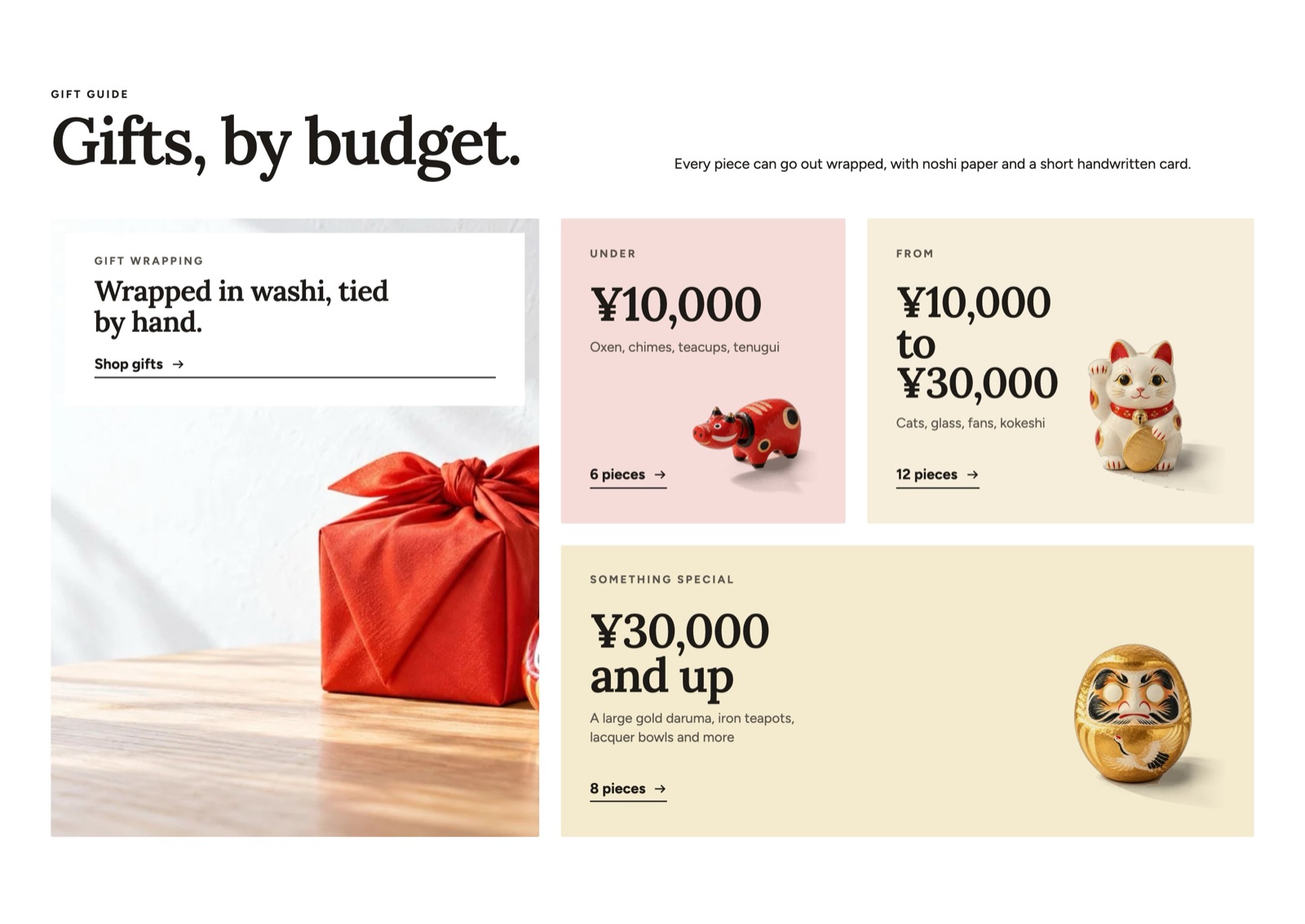
Ready-made versions when you add it: Gift guide, Gifts by budget.
Sizes and layout
- Columns on desktop †: 1 to 4 (default 3).
- Price line size †: 24 to 96 px, in steps of 2 (default 52).
- Text size †: 12 to 22 px (default 15).
- Tile height †: 200 to 600 px, in steps of 8 (default 312).
- Cut-out size †: 30 to 100 %, in steps of 2 (default 70).
Other settings: Layout, Image, Show noshi preview, Start date and time, End date and time, Hide outside the dates.
Also has the standard section settings.
Blocks you can add
- Gift option block
- Other settings: Option type, Icon, Image, Heading, Text, Button label, Link, Product.
- Budget tile block
- Tile style: Color field, Photo (default Color field).
- Width: Auto, Narrow, Medium, Half, Wide, Full (default Auto).
- Other settings: Small label, Price line, Text, Image, Link, Link label, Field color.
Fixed blocks (always part of the section; select them in the sidebar to change them)
- Section heading (shared block, see Shared blocks)
Offers
Standing benefits and discount codes shown as tickets. Codes can be copied or applied with one click.
Ready-made versions when you add it: Offers, Coupons.
Sizes and layout
- Columns on desktop: 1 to 4 (default 3).
Other settings: Layout, Offer style, Apply discount with link.
Also has the standard section settings.
Blocks you can add
- Offer block
- Other settings: Icon, Heading, Text, Discount code, Link, End date and time.
Fixed blocks (always part of the section; select them in the sidebar to change them)
- Section heading (shared block, see Shared blocks)
Countdown
The time left until a sale, a release or an order window ends. It counts down only to a date you set.
Ready-made versions when you add it: Countdown, Countdown: until release.
Other settings: Heading, Source, Start date and time, End date and time, Start date metafield, End date metafield, When it ends, End message, Timer style, Layout, Image.
Also has the standard section settings.
Blocks you can add
- Text (shared block, see Shared blocks)
- Buttons (shared block, see Shared blocks)