
Collection page
To edit collection pages, open the theme editor and choose Collections > Default collection from the page menu at the top. The page has two sections by default: the Collection banner and the Product grid. Every setting with its full range is listed in Collection, search and list pages.
Collection banner
The banner shows the collection's name, image and description.
| Setting | Choices or range | Notes |
|---|---|---|
| Show collection image | On or off | Uses the image set on the collection in the Shopify admin. |
| Image placement | Beside, Overlay, Above, Color field with a shelf | |
| Height | Small, Medium, Large, Full screen, Adapt to image | With Overlay. |
| Overlay opacity | 0 to 80 % | With Overlay. Darkens the image so text stays readable. |
| Content position | Nine positions, from Top left to Bottom right | With Overlay. |
| Heading size | Small, Medium, Large, Display | |
| Content alignment | Start, Center | |
| Show description, Show product count | On or off | |
| Subcollections, Subcollections style | Collections; Chips or Images | Links to related collections under the heading. |
| Display heading | Text | A large line above the collection name, such as an English word. Connect it to a collection metafield to give each collection its own. |
| Feature number | Text | Shown as "No.03" above the name. Connect it to a collection metafield to number each collection. |
| Chapter opener | On or off | When the collection is linked from the top level of the main menu, the heading shows its chapter number and the menu item's name. |
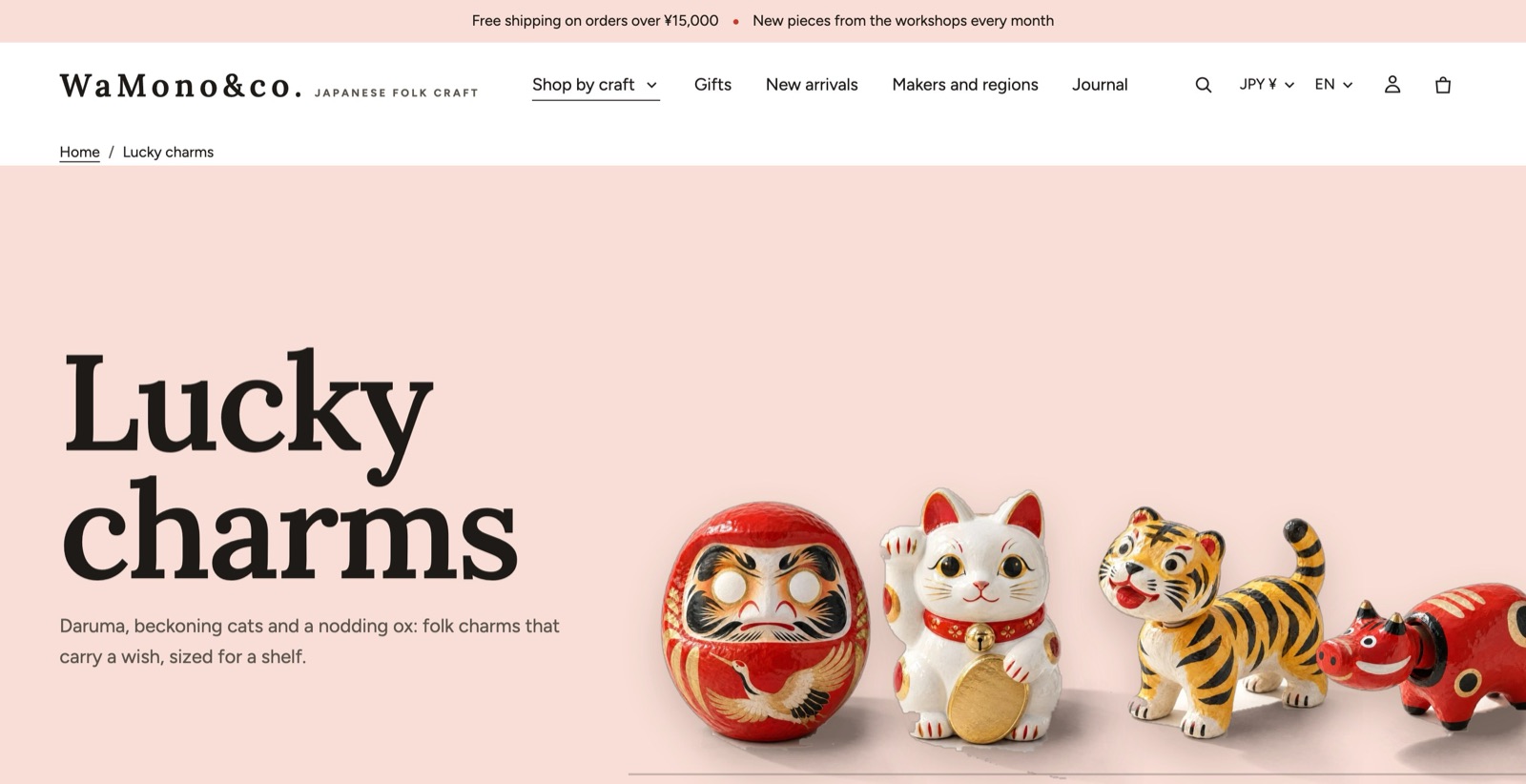
The color field with a shelf
With Image placement set to Color field with a shelf, the banner becomes a pale color field with some of the collection's products standing on a shelf.
- Products on the shelf: 2 to 6.
- Shelf piece size: Small, Medium, Large.
- Field color: leave it blank to use the collection metafield custom.field_colour, then the palette's blush color.
Each product stands as its custom.cutout picture (a .png with a transparent background, free on the field with a soft shadow), or as its first photo blended into the field. Photos on a white background blend best; the edges of every photo fade out, so a grey or cream background never shows as a rectangle. For products that stand free with their own shadow, add a cut-out. See Metafields.
Product grid
| Setting | Choices or range | Notes |
|---|---|---|
| Columns on desktop | 2 to 6 | |
| Columns on mobile | 1, 2 | |
| Products per page | 8 to 48, in steps of 4 | |
| Pagination | Page numbers, Load more, Infinite scroll | Page links always stay in the page, so search engines and shoppers without JavaScript reach every product. Infinite scroll pauses after three automatic loads, and coming back from a product returns shoppers to where they were. |
| Enable filtering | On or off | |
| Filter layout | Sidebar, Drawer, Horizontal | On phones, filters open from the bottom. |
| Show filter counts | On or off | |
| Show more after (values) | 3 to 20 | Long filter lists collapse after this many values. |
| Open filter groups | None, First only, All | With Sidebar. |
| Enable sorting | On or off | |
| Show column switcher | On or off | Lets shoppers change the number of columns. |
| Sidebar menu | Menu | A list of links above the filters, for example your other collections. Give it a Sidebar menu heading, and choose Sidebar menu on mobile (Drawer or Scroll). |
| Card image ratio, Card hover effect | Override the theme settings for this grid. |
Filters
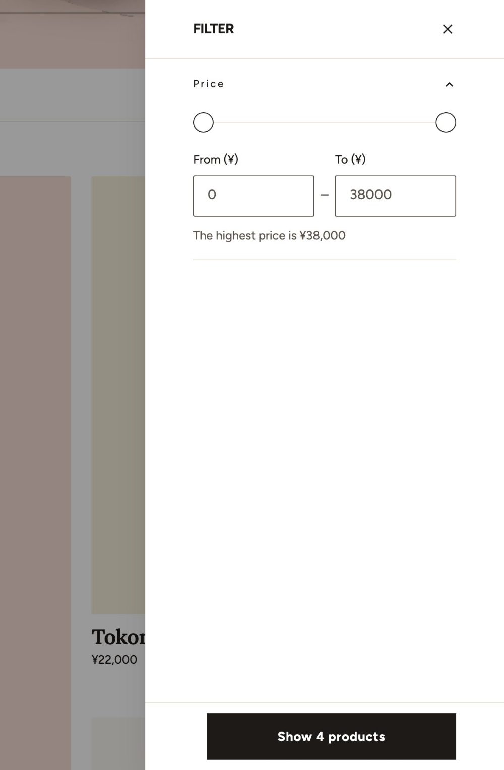
Kyoto uses Shopify's own storefront filters. Choose which filters appear (availability, price, product type, vendor, options such as color or size, or metafields) in the Shopify Search & Discovery app, under Filters. Color filters show swatches when your option values have colors.
Grid look
The Grid look block is always part of the Product grid. Select it in the sidebar to change how the grid feels.
| Setting | Choices | What it does |
|---|---|---|
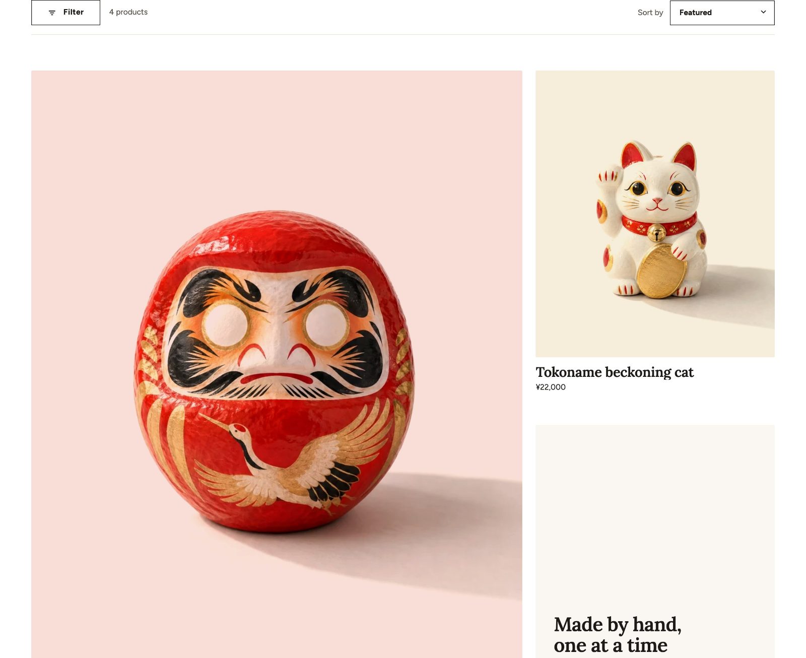
| First product large (2 × 2) | On or off | The first product takes four cells. Only on the first page, without filters and in the collection's own order, with 3 or more products and columns. |
| Photos on pale color fields | On or off | For photos on a white ground: the white becomes a pale color field and the real shadow stays. |
| Field colors | Palette colors in turn, Single | With Single, choose the Field color. A product's custom.field_colour metafield always wins. |
| Name and price under the picture | On or off | Under every picture, whatever the card style. |
| Product name size | Use theme setting, Medium, Large, Extra large | |
| Row spacing | Use theme setting, Medium, Large, Extra large | |
| Motion | None, Subtle, Bold |
When Card style in Theme settings > Product cards is Color field, label plate beside the object, turn on Adjust the label plate card in this block to size the cards: Color field shape (Square, Landscape, Wide), Label plate width (28 to 50 %), Product name size on the plate (Small, Medium, Large, Extra large), Price size on the plate (Small, Medium, Large), Object size (60 to 100 %), Object’s foot in the photo (60 to 100 %, default 82) and Floor line (None, Thin, Medium, Thick).
Promo tiles
Add Promo tile blocks to the Product grid to place an image, a video, a color, a product, a collection or an article between the products.
- Position in grid: 1 to 48 (under Show more settings).
- Column span: 1 or 2.
- Hide when filtered: hides the tile while a filter is active, so it never sits between filtered results.
- Content position and Overlay opacity (0 to 80 %).
Collection description
To show a long collection description under the products instead of above them, turn off Show description in the Collection banner, then add the Collection description section under the Product grid. Set its Maximum width.
Product comparison
Turn on Show compare checkbox in Theme settings > Product cards (under Show more settings), then add the Product comparison section to the collection page or to a page. Shoppers tick up to four products and compare them row by row. Choose the rows with Compare row blocks: price, rating, vendor, type, an option or a metafield.
Collections list page
The page at /collections lists all your collections, or the ones you choose. Choose it in the theme editor under Collections list. Settings: Source (All, Selected), Sort order, Collections per page (8 to 48), Columns on desktop (2 to 6), Columns on mobile (1, 2), Collection card style, Show product count and Layout (Grid, Contents).