
Text, image and story sections
Sections for your story, your makers and anything you want to explain with words and pictures.
Every size setting is listed with its full range or its choices and the default. A dagger (†) marks a setting that appears only after you choose a related option. “Other settings” lists the remaining options by their name in the theme editor.
Text
Rich text
A heading, a few lines of text, a quote and buttons. Japanese and Chinese text can be set vertically.
Ready-made versions when you add it: Rich text, Vertical heading.
Sizes and layout
- Content width: Narrow, Normal, Wide (default Narrow).
- Lines when collapsed †: 3 to 12 (default 6).
Other settings: Content alignment, Text direction, Collapse long text.
Also has the standard section settings.
Blocks you can add
- Text (shared block, see Shared blocks)
- Buttons (shared block, see Shared blocks)
- Quote (shared block, see Shared blocks)
- Icon with text (shared block, see Shared blocks)
- Custom liquid (shared block, see Shared blocks)
Scrolling text
A short statement set large that is read in step with the scroll.
Sizes and layout
- Text size: Medium, Large, Extra large (default Large).
Other settings: Text, Alignment, Highlight style.
Also has the standard section settings.
Marquee
A band of words, logos or small images that moves sideways.
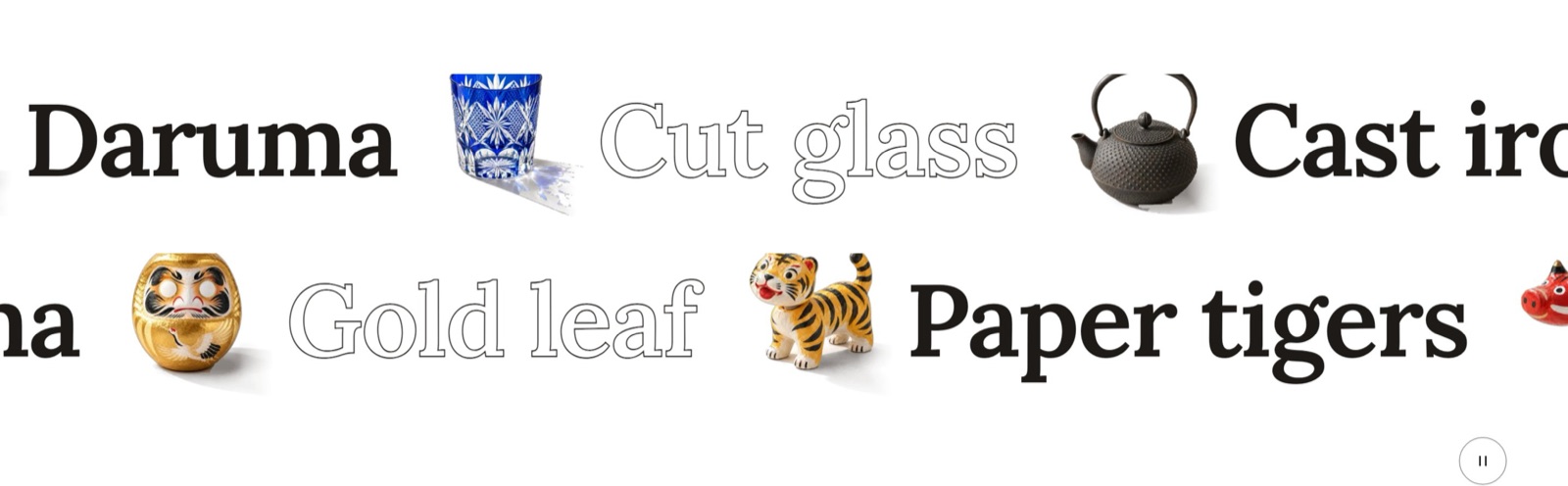
Ready-made versions when you add it: Marquee: display band, Marquee, Marquee: crossed bands.
Sizes and layout
- Text size: Small, Medium, Large, Extra large, Extra extra large (default Large).
- Picture size †: 60 to 200 %, in steps of 5 (default 100).
- Item spacing †: Auto, Extra small, Small, Medium, Large, Extra large (default Auto).
Other settings: Separator, Tilt bands, Scroll speed, Scroll direction, Pause on hover and focus, Link speed to scrolling, Letter style, Lettering, Picture style.
Also has the standard section settings.
Blocks you can add
- Marquee item block
- Other settings: Text, Image, Video, Link, Letter style.
Ticker band
A thin band of one-line news or your latest blog posts that moves slowly.
Ready-made versions when you add it: Ticker band, Ticker band: latest posts.
Sizes and layout
- Text size: Small, Medium (default Small).
Other settings: Source, Blog, Number of posts, Show date, Label, Separator, Rules above and below, Scroll speed, Scroll direction, Pause on hover and focus.
Also has the standard section settings.
Blocks you can add
- Ticker line block
- Other settings: Text, Link, Tag.
FAQ
Questions and answers that open one by one, with optional topic headings, a search field and FAQ data for search engines.
Other settings: Layout, Open first row, Allow multiple open, Show search, Add structured data.
Also has the standard section settings.
Blocks you can add
- Question block
- Other settings: Question, Answer.
- FAQ heading block
- Other settings: Heading.
Fixed blocks (always part of the section; select them in the sidebar to change them)
- Section heading (shared block, see Shared blocks)
Comparison table
A table that compares up to five columns row by row, with one highlighted column.
Sizes and layout
- Number of columns: 2 to 5 (default 3).
- Highlight column: None, 1, 2, 3, 4, 5 (default 1).
Other settings: Column 1 heading, Column 2 heading, Column 3 heading, Column 4 heading, Column 5 heading.
Also has the standard section settings.
Blocks you can add
- Comparison row block
- Other settings: Label, Column 1 value, Column 2 value, Column 3 value, Column 4 value, Column 5 value, Note.
Fixed blocks (always part of the section; select them in the sidebar to change them)
- Section heading (shared block, see Shared blocks)
Footnotes
Numbered notes gathered at the foot of a page.
Ready-made versions when you add it: Footnotes, Notes (asterisk).
Sizes and layout
- Text size: Small, Medium (default Small).
Other settings: Note marker, Link note markers.
Also has the standard section settings.
Blocks you can add
- Footnote block
- Other settings: Text.
Image and text
Image with text
A picture or video beside text, buttons, icons or a quote. A cut-out object can reach out of the picture.
Ready-made versions when you add it: Image with text, Image with text: overlap, Image with text: exhibit.
Sizes and layout
- Media width: 50, 55, 60, 65 (default 50).
- Media aspect ratio: Adapt to image, Portrait, Tall, Square, Landscape, Wide, Vertical (default Adapt to image).
- Object size (% of the picture) †: 20 to 80 % (default 52).
- Object reach past the picture (%) †: 0 to 60 % (default 22).
- Object drop below the picture (%) †: 0 to 50 % (default 14).
Other settings: Media type, Image, Video, Layout, Media position, Media position on mobile, Vertical alignment, Cut-out object.
Also has the standard section settings.
Blocks you can add
- Text (shared block, see Shared blocks)
- Buttons (shared block, see Shared blocks)
- Icon with text (shared block, see Shared blocks)
- Quote (shared block, see Shared blocks)
- Custom liquid (shared block, see Shared blocks)
Images with text
Two or three pictures set as a small composition next to text.
Ready-made versions when you add it: Images with text: overlap, Images with text: collage.
Sizes and layout
- Media aspect ratio: Adapt to image, Portrait, Tall, Square, Landscape, Wide, Vertical (default Portrait).
Other settings: Layout, Media position, Media position on mobile, Vertical alignment, Scroll effect.
Also has the standard section settings.
Blocks you can add
- Image block
- Other settings: Image, Mobile image, Caption.
- Text (shared block, see Shared blocks)
- Buttons (shared block, see Shared blocks)
Multicolumn
Features, services or makers as columns of icon or image, heading, text and link.
Ready-made versions when you add it: Columns: icons, Columns: images, Makers.
Sizes and layout
- Columns on desktop: 1 to 6 (default 3).
- Columns on mobile: 1, 2 (default 1).
- Media aspect ratio: Adapt to image, Portrait, Tall, Square, Landscape, Wide, Vertical (default Square).
- Column style: Plain, Boxed, Divider lines (default Plain).
- Column alignment: Start, Center (default Start).
Other settings: Layout, Mobile layout, Controls.
Also has the standard section settings.
Blocks you can add
- Column block
- Other settings: Icon, Image, Heading, Text, Link label, Link.
Fixed blocks (always part of the section; select them in the sidebar to change them)
- Section heading (shared block, see Shared blocks)
Multirow
Image and text rows stacked in one section, optionally switching sides row by row.
Sizes and layout
- Media aspect ratio: Adapt to image, Portrait, Tall, Square, Landscape, Wide, Vertical (default Landscape).
- Media width: 40, 50, 60 (default 50).
Other settings: Media position, Alternate sides, Show progress line.
Also has the standard section settings.
Blocks you can add
- Row block
- Other settings: Image, Video, Heading, Text, Link, Button label.
Feature list
Materials, features or how-to steps, each with a short and an optional longer explanation.
Ready-made versions when you add it: Features, Materials, How to use.
Sizes and layout
- Columns on desktop: 1 to 4 (default 3).
- Columns on mobile: 1, 2 (default 1).
- Column style: Plain, Boxed, Divider lines (default Plain).
Other settings: Layout, Image, Details display, Auto-advance (seconds).
Also has the standard section settings.
Blocks you can add
- Feature block
- Other settings: Icon, Image, Heading, Text, Details, Value, Link.
Fixed blocks (always part of the section; select them in the sidebar to change them)
- Section heading (shared block, see Shared blocks)
Content tabs
Pictures, text and a button in panels switched with tabs.
Sizes and layout
- Media aspect ratio: Adapt to image, Portrait, Tall, Square, Landscape, Wide, Vertical (default Landscape).
Other settings: Tab position, Tab style, Media position, Autoplay, Autoplay interval, Tab transition.
Also has the standard section settings.
Blocks you can add
- Tab block
- Other settings: Label, Image, Heading, Text, Link, Button label.
Fixed blocks (always part of the section; select them in the sidebar to change them)
- Section heading (shared block, see Shared blocks)
Image accordion
Tall picture strips side by side. The open strip widens and shows its text and link.
Sizes and layout
- Height: Small, Medium, Large (default Medium).
Other settings: Open on, Mobile layout.
Also has the standard section settings.
Blocks you can add
- Accordion panel block
- Other settings: Image, Heading, Text, Link, Button label.
Image gallery
Photos in a grid, a masonry, a carousel or a free sideways scroll, with an optional lightbox.
Ready-made versions when you add it: Image gallery, Customer photos.
Sizes and layout
- Columns on desktop: 2 to 6 (default 4).
- Columns on mobile: 1, 2, 3 (default 2).
- Media aspect ratio: Adapt to image, Portrait, Tall, Square, Landscape, Wide, Vertical (default Square).
Other settings: Layout, Mobile layout, Open images in lightbox, Show captions.
Also has the standard section settings.
Blocks you can add
- Image block
- Other settings: Image, Caption, Link, Credit, Disclosure label, Product.
Fixed blocks (always part of the section; select them in the sidebar to change them)
- Section heading (shared block, see Shared blocks)
Before and after
Two photos of the same thing compared with a handle, with a note for conditions.
Ready-made versions when you add it: Before and after, Before/after with text.
Sizes and layout
- Handle start position: 0 to 100 % (default 50).
- Media aspect ratio: Adapt to image, Portrait, Tall, Square, Landscape, Wide, Vertical (default Adapt to image).
Other settings: Before image, After image, Before label, After label, Orientation, Layout, Media position, Note.
Also has the standard section settings.
Blocks you can add
- Text (shared block, see Shared blocks)
- Buttons (shared block, see Shared blocks)
Video
A video with an optional cover image and transcript.
Sizes and layout
- Media aspect ratio: Adapt to image, Portrait, Tall, Square, Landscape, Wide, Vertical (default Wide).
Other settings: Video source, Video, Mobile video, Video URL, Cover image, Autoplay, Loop video, Transcript, Show cursor label on video.
Also has the standard section settings.
Fixed blocks (always part of the section; select them in the sidebar to change them)
- Section heading (shared block, see Shared blocks)
Stories told while scrolling
Sticky scroll
A story told in steps: the image stays in view while the text scrolls past, and changes with the step being read.
Sizes and layout
- Media aspect ratio: Adapt to image, Portrait, Tall, Square, Landscape, Wide, Vertical (default Portrait).
Other settings: Media position, Transition, Show step numbers.
Also has the standard section settings.
Blocks you can add
- Step block
- Other settings: Image, Heading, Text, Link, Button label.
Fixed blocks (always part of the section; select them in the sidebar to change them)
- Section heading (shared block, see Shared blocks)
Stacked cards
Makers, workshops or places as large cards that pile up while the page scrolls.
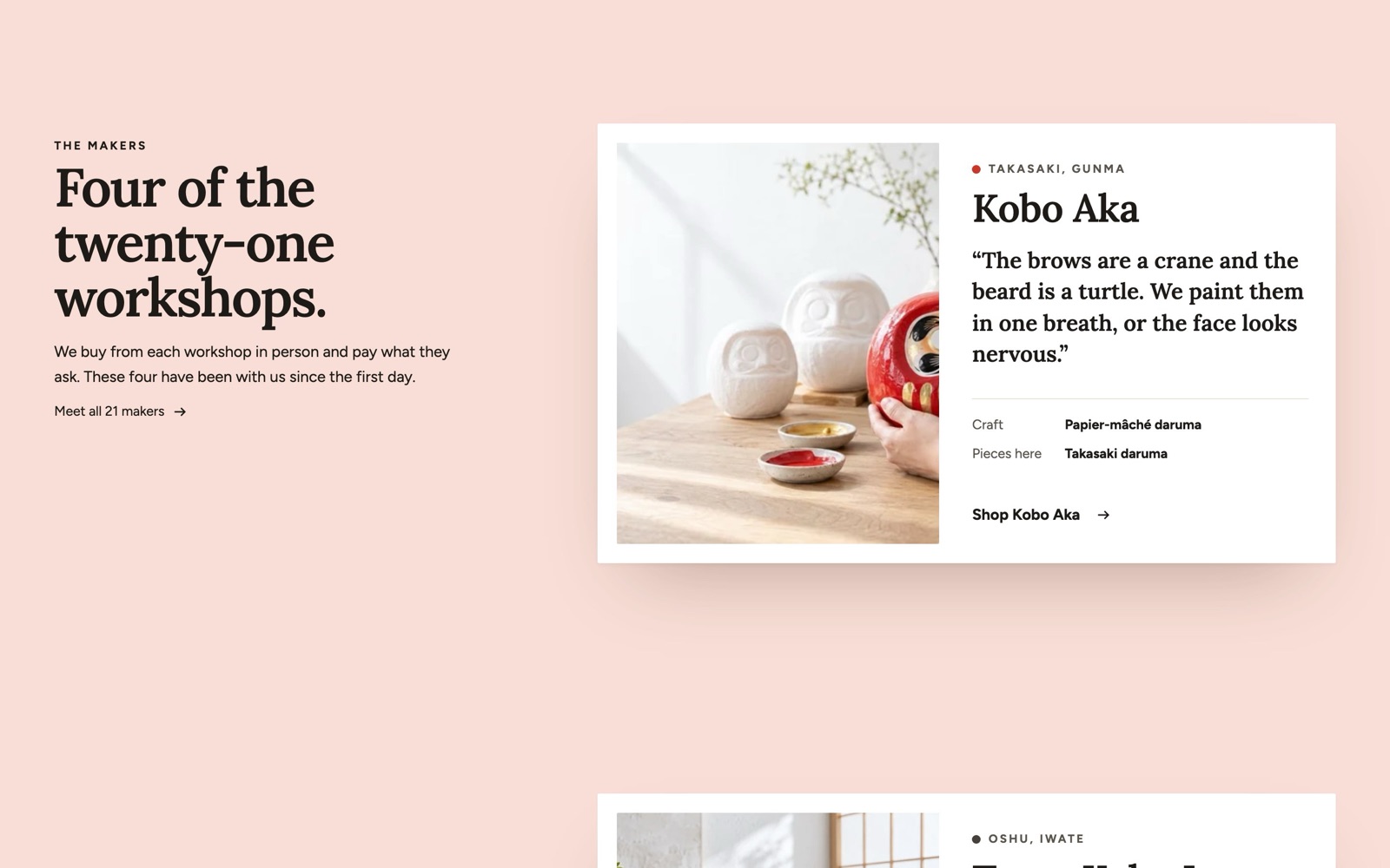
Sizes and layout
- Card width (largest): 480 to 1200 px, in steps of 20 (default 780).
- Image ratio: Portrait, Tall, Square, Landscape (default Portrait).
- Image width: 30 to 60 % (default 46).
- Name size: 20 to 72 px (default 40).
- Quote size: 14 to 36 px (default 23).
- Stack offset: 0 to 60 px, in steps of 2 (default 22).
- Scroll between cards: 10 to 80 %, in steps of 5 (default 30). In % of the screen height, from 990px wide.
Other settings: Introduction, Background takes each card's color, Earlier cards shrink slightly.
Also has the standard section settings.
Blocks you can add
- Card block
- Other settings: Image, Place, Name, Quote, Fact 1: term, Fact 1: value, Fact 2: term, Fact 2: value, Link, Link label, Card color (background), Dot color.
Fixed blocks (always part of the section; select them in the sidebar to change them)
- Section heading (shared block, see Shared blocks)
Statistics
Real figures about your shop set large, optionally counting up once when they come into view.
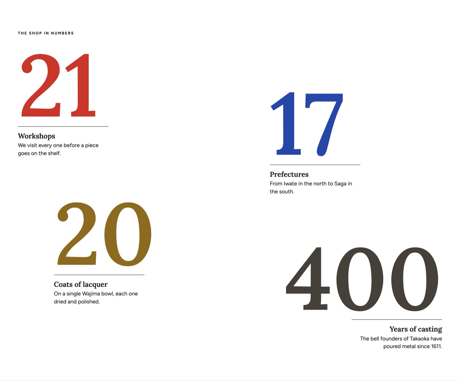
Sizes and layout
- Columns on desktop †: 2 to 6 (default 4).
- Column alignment †: Start, Center (default Center).
- Column style †: Plain, Boxed, Divider lines (default Divider lines).
- Count-up duration †: Auto, Short, Long (default Auto).
- Number size (largest): 40 to 320 px, in steps of 4 (default 280). The number never grows past the screen or its column; long values shrink to fit.
- Label size: 12 to 40 px (default 22).
- Text size: 12 to 24 px (default 17).
- Row spacing: 0 to 160 px, in steps of 4 (default 32).
- Stagger †: 0 to 240 px, in steps of 8 (default 120).
Other settings: Layout, Count up numbers, Count-up style, Note, Slide in from the sides.
Also has the standard section settings.
Blocks you can add
- Statistic block
- Other settings: Value, Prefix, Suffix, Label, Text, Count-up start, Number color.
Fixed blocks (always part of the section; select them in the sidebar to change them)
- Section heading (shared block, see Shared blocks)
Timeline
Your history or the steps of making something, in order. Also works as numbered steps.
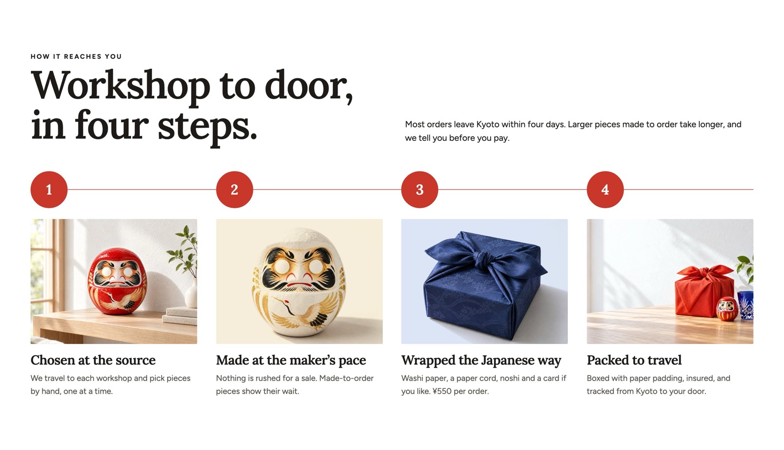
Ready-made versions when you add it: Timeline, Steps.
Sizes and layout
- Media aspect ratio: Adapt to image, Portrait, Tall, Square, Landscape, Wide, Vertical (default Landscape).
- Columns on desktop †: 2 to 6 (default 4).
- Number dot size †: 32 to 120 px, in steps of 2 (default 68).
- Heading size †: 14 to 48 px (default 24).
- Text size †: 12 to 22 px (default 15).
Other settings: Layout, Show progress line, Controls, Start the progress at.
Also has the standard section settings.
Blocks you can add
- Timeline item block
- Other settings: Label, Heading, Text, Image, Image ground color.
Fixed blocks (always part of the section; select them in the sidebar to change them)
- Section heading (shared block, see Shared blocks)
Magazine-style sections
Feature spread
One feature laid out as a magazine spread on a colored page: one large frame and smaller ones for images, videos, products, collections or articles.
Ready-made versions when you add it: Feature spread, Feature spread: dark, Feature spread: chapter.
Sizes and layout
- Media aspect ratio: Portrait, Tall, Square, Landscape, Wide (default Square). Large and small frames share this ratio.
- Text size: Small, Medium, Large, Extra large (default Medium).
Other settings: Chapter, First large frame, Link, Link label, Joint to the next section, Text position, Show the chapter number.
Also has the standard section settings.
Blocks you can add
- Frame block
- Other settings: Frame type, Image, Video, Product, Collection, Article, Label, Heading, Link.
Fixed blocks (always part of the section; select them in the sidebar to change them)
- Section heading (shared block, see Shared blocks)
Feature index
The contents page of a feature: a cover with a moving word, then the numbered entries.
Sizes and layout
- Speed (per second) †: 10 to 80 px, in steps of 5 (default 30).
Other settings: Show the cover, Cover image, Moving word, Heading, Text, Before each number.
Also has the standard section settings.
Blocks you can add
- Feature entry block
- Other settings: Article, Product, Collection, Link, Image, Issue number, Heading, Text, Button label.
Issue contents
Lists the features of the page with large numbers, names, short texts and small pictures. Without entries it lists your collections.
Ready-made versions when you add it: Issue contents, Issue contents: 3 columns.
Sizes and layout
- Columns on desktop †: 1 to 3 (default 2).
- Image ratio †: Square, Portrait, Landscape (default Square).
Other settings: Layout, Number style, Show images, Show count.
Also has the standard section settings.
Blocks you can add
- Contents entry block
- Other settings: Number, Name (English), Translation, Collection, Link, Text, Image, Show more settings, Target page link ID, Side note (issue, date), Use its own color scheme.
Fixed blocks (always part of the section; select them in the sidebar to change them)
- Section heading (shared block, see Shared blocks)
Issue navigation
A thin band that lists the features of the page and marks the one being read.
Other settings: Stick to top, Content alignment, Show numbers, Show translations.
Also has the standard section settings.
Blocks you can add
- Navigation entry block
- Other settings: Number, Name (English), Translation, Target page link ID, Link.
In-page navigation
Tabs that jump to the parts of a long page. Give the target sections a Page link ID.
Other settings: Stick to top, Content alignment, Tab style.
Also has the standard section settings.
Blocks you can add
- Jump link block
- Other settings: Label, Target page link ID.
What is new
The newest articles in two columns, with the current issue in a small box beside them.
Other settings: Blog, Filter by tag, Number to show, Show view all link, Moving band of titles, Show the current issue, Product, Issue number, Heading, Text, Button label, Front cover, Second cover, Third cover, Link.
Also has the standard section settings.
Fixed blocks (always part of the section; select them in the sidebar to change them)
- Section heading (shared block, see Shared blocks)
Series carousel
A running series of articles as square cards in one full-width row.
Sizes and layout
- Speed (per second) †: 20 to 80 px, in steps of 5 (default 40).
Other settings: Blog, Series tag, Number to show, Movement, Controls, Stepped card heights, Show view all link.
Also has the standard section settings.
Fixed blocks (always part of the section; select them in the sidebar to change them)
- Section heading (shared block, see Shared blocks)
Blog posts
The newest articles of one blog as a journal, a grid or an editorial layout.
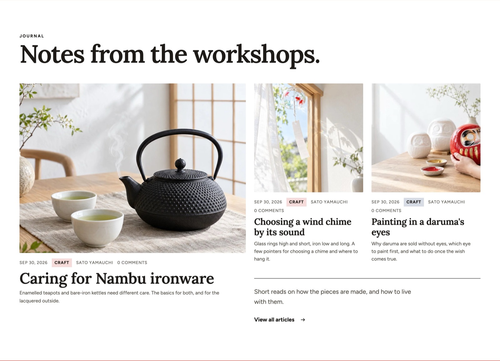
Ready-made versions when you add it: Journal, Blog posts: grid, Blog posts: editorial.
Sizes and layout
- Columns on desktop: 1 to 4 (default 3).
- Article image ratio: Use theme setting, Adapt to image, Portrait, Tall, Square, Landscape, Wide (default Use theme setting).
- Story heading size †: 16 to 48 px (default 26).
- Large story heading size †: 20 to 80 px, in steps of 2 (default 44).
Other settings: Number to show, Filter by tag, Layout, Mobile layout, Controls, Show view all link, Show featured products, Blog, Show the chapter number, Line beside the blog link.
Also has the standard section settings.
Fixed blocks (always part of the section; select them in the sidebar to change them)
- Section heading (shared block, see Shared blocks)
Colophon
Who makes the shop and where to find it: a heading, your description and a list of facts.
Other settings: Heading, Text, Show the store address, Show the contact email and phone.
Also has the standard section settings.
Blocks you can add
- Colophon line block
- Other settings: Label, Text.
Trust and social proof
Testimonials
Customers' own words with a name, an optional rating, a photo and the product they bought.
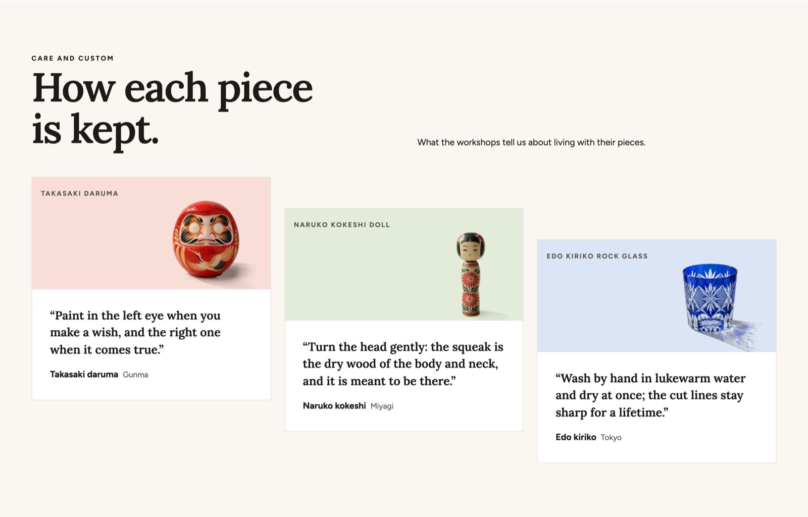
Ready-made versions when you add it: Testimonials, Testimonials: one quote.
Sizes and layout
- Columns on desktop: 1 to 4 (default 3).
- Column style: Plain, Boxed, Divider lines (default Boxed).
- Quote size †: 14 to 36 px (default 21).
- Product panel height †: 96 to 360 px, in steps of 8 (default 200).
- Stagger †: 0 to 160 px, in steps of 4 (default 56).
Other settings: Layout, Mobile layout, Controls, Autoplay, Autoplay interval, Show rating, Note.
Also has the standard section settings.
Blocks you can add
- Testimonial block
- Other settings: Quote, Author, Author details, Rating, Image, Disclosure label, Product, Product cut-out, Product panel color.
- App blocks from apps you install
Fixed blocks (always part of the section; select them in the sidebar to change them)
- Section heading (shared block, see Shared blocks)
Press
Magazines, media and awards that featured the shop, each with a logo and a short quote.
Sizes and layout
- Columns on desktop †: 1 to 4 (default 3).
- Logo height: 24 to 120 px, in steps of 4 (default 40).
Other settings: Layout, Autoplay, Autoplay interval, Controls.
Also has the standard section settings.
Blocks you can add
- Press mention block
- Other settings: Image, Quote, Name, Link.
Fixed blocks (always part of the section; select them in the sidebar to change them)
- Section heading (shared block, see Shared blocks)
Logo list
Logos of makers, stockists or certification marks in a row or a moving band.
Ready-made versions when you add it: Logo list, Where to buy, Certification marks.
Sizes and layout
- Columns on desktop †: 3 to 8 (default 5).
- Logo height: 24 to 120 px, in steps of 4 (default 48).
Other settings: Layout, Grayscale until hover, Scroll speed, Scroll direction, Pause on hover and focus.
Also has the standard section settings.
Blocks you can add
- Logo block
- Other settings: Image, Link, Name.
Fixed blocks (always part of the section; select them in the sidebar to change them)
- Section heading (shared block, see Shared blocks)
Trust badges
Short promises (free shipping, returns, secure payment) with icons and optional payment icons.
Sizes and layout
- Column alignment: Start, Center (default Center).
- Column style: Plain, Boxed, Divider lines (default Plain).
Other settings: Layout, Show payment icons.
Also has the standard section settings.
Blocks you can add
- Promise block
- Other settings: Icon, Heading, Text, Details, Page.
Store information and forms
Newsletter
An email signup, with an optional image.
Ready-made versions when you add it: Newsletter, Newsletter: with image.
Sizes and layout
- Content width: Narrow, Normal, Wide (default Narrow).
Other settings: Layout, Image, Media position, Consent text, Show privacy link, Require consent.
Also has the standard section settings.
Blocks you can add
- Text (shared block, see Shared blocks)
- Buttons (shared block, see Shared blocks)
- Image (shared block, see Shared blocks)
- App blocks from apps you install
Fixed blocks (always part of the section; select them in the sidebar to change them)
- Section heading (shared block, see Shared blocks)
Contact form
Shopify's contact form with fields you choose.
Sizes and layout
- Content width: Narrow, Normal (default Narrow).
Other settings: Show phone field, Require phone, Submit button label, Success message, Consent text, Require consent.
Also has the standard section settings.
Blocks you can add
- Form field block
- Width: Full, Half (default Full).
- Other settings: Label, Field type, Options, Required, Placeholder.
Fixed blocks (always part of the section; select them in the sidebar to change them)
- Section heading (shared block, see Shared blocks)
Events
Upcoming workshops, pop-up shops and live streams, with add-to-calendar links.
Sizes and layout
- Columns on desktop †: 1 to 4 (default 3).
Other settings: Layout, Number to show, Hide past events, Show add to calendar, Add structured data.
Also has the standard section settings.
Blocks you can add
- Event block
- Other settings: Heading, Start date and time, End date and time, Location, Text, Image, Link, Event status.
Fixed blocks (always part of the section; select them in the sidebar to change them)
- Section heading (shared block, see Shared blocks)
Store locations
Your stores and stockists with address, hours, phone and a map link, optionally grouped by region.
Ready-made versions when you add it: Store locations, Store directory.
Sizes and layout
- Columns on desktop †: 1 to 4 (default 2).
Other settings: Layout, Map display, Map link service, Show sort by distance, Add structured data, Regions.
Also has the standard section settings.
Blocks you can add
- Store block
- Other settings: Name, Address, Hours, Phone, Image, Map search address, Link, Show more settings, Latitude, Longitude, Store type.
- Region block
- Other settings: Heading, Open when the page loads.
- Also takes these blocks, described above: Store.
Fixed blocks (always part of the section; select them in the sidebar to change them)
- Section heading (shared block, see Shared blocks)
Store selector
Lets a shopper choose “my store” once. The choice is saved only in their browser.
Other settings: Label, Show sort by distance, Show hours.
Also has the standard section settings.
Blocks you can add
- Store block
- Other settings: Name, Address, Hours, Phone, Image, Map search address, Link, Show more settings, Latitude, Longitude, Store type.
Legal table
A two-column table, for example the seller disclosure required in Japan or a company profile.
Ready-made versions when you add it: Legal notice (Japan), Company profile.
Other settings: Note.
Also has the standard section settings.
Blocks you can add
- Table row block
- Other settings: Label, Value.
Link list
Quick links or category buttons, from a menu or from blocks.
Ready-made versions when you add it: Link list, Category buttons.
Sizes and layout
- Columns on desktop †: 2 to 6 (default 4).
Other settings: Link style, Layout, Content alignment, Menu.
Also has the standard section settings.
Blocks you can add
- Link block
- Other settings: Label, Link, Icon, Image.
Fixed blocks (always part of the section; select them in the sidebar to change them)
- Section heading (shared block, see Shared blocks)
Layout, apps and code
Divider
Space and an optional line between two sections.
Ready-made versions when you add it: Divider, Space.
Sizes and layout
- Line width †: Full, Content width, Short (default Content width).
Other settings: Line style.
Also has the standard section settings.
Custom section
A free-form section that takes any theme block and app block, for layouts the other sections do not cover.
Ready-made versions when you add it: Custom section, Two columns, Icons and text.
Sizes and layout
- Spacing: 0 to 96 px, in steps of 4 (default 24).
- Content width: Narrow, Normal, Wide (default Normal).
- Height: Small, Medium, Large, Full screen, Adapt to image (default Adapt to image).
- Overlay opacity †: 0 to 80 %, in steps of 5 (default 0). Darken the picture until the text on it is easy to read (contrast 4.5:1).
Other settings: Direction, Content alignment, Vertical alignment, Stack on mobile, Media type, Image, Video.
Also has the standard section settings.
Blocks you can add
- Any shared theme block (see the shared blocks page)
- App blocks from apps you install
Apps
Holds app blocks so they get the theme's page width, spacing and colors.
Also has the standard section settings.
Blocks you can add
- App blocks from apps you install
Custom liquid
Your own Liquid or HTML code inside the theme's frame. See the developer page before you use it.
Other settings: Liquid.
Also has the standard section settings.