
Header and footer
The header and footer appear on every page. In the theme editor, they are in the Header and Footer areas at the top and bottom of the left sidebar. Every setting with its full range is listed in Header, footer and bars.
Menus first
Create your menus in Online Store > Navigation before you set up the header:
- Main menu: your main sections, such as collections. Links with nested links open a mega menu or a dropdown.
- Secondary menu (optional): short links such as Help or Stores.
- Footer menu: policies, contact, about.
Then choose them in the Header section: Menu, Secondary menu and Account menu.
Header
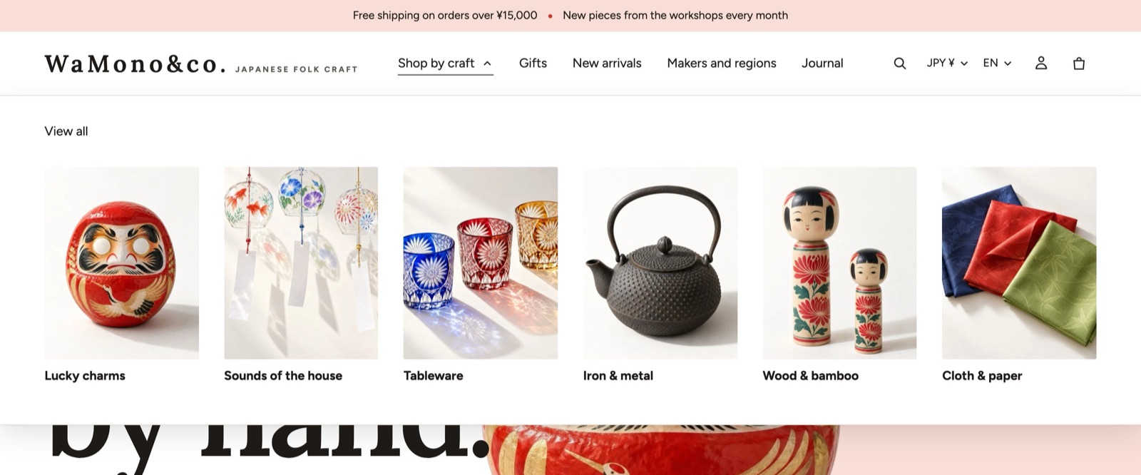
Kyoto installs with Logo left, menu center, a header that hides when shoppers scroll down and returns when they scroll up, and mega menus with collection images.
Layout
| Setting | Choices | Notes |
|---|---|---|
| Layout | Logo left, menu center; Logo left, menu left; Logo center, menu left; Logo center, menu below; Drawer; Logo center, menu split; Logo left, menu below; Issue index (replaces the page); Logo left, chapters in page-edge tabs | Issue index (replaces the page) replaces the menu row with one button that turns the whole page into an index. Logo left, chapters in page-edge tabs moves the main menu's links to collections and blogs into numbered tabs at the edge of the page (turn on Show the chapter tabs in the Chapter tabs block). |
| Mobile menu style | Drawer, Bottom sheet, Fullscreen | |
| Mega menu style | Columns, Columns with images, Drawer (desktop too), Dropdown, Tabs, Auto | Auto opens a mega menu for large menu items and a dropdown for small ones. |
| Open mega menu on | Hover, Click | |
| Search on desktop | Icon, Bar | Bar shows a search field from 1024 px wide. |
| Search on mobile | Icon, Search bar below | |
| Search and cart style | Icon, Text, Icon and text | |
| Sticky behavior | None, Always, Show on scroll up, Always (compact while scrolling), Show on scroll up (compact) | |
| Transparent on | Off, Home, Home and collections, All | Works only when the page starts with a Hero or Slideshow set to Overlay, or with Hero with links. The header turns solid when shoppers scroll. Choose a Transparent color scheme and add an Inverse logo for dark images. |
Under Advanced > Show more settings: Mobile logo position (Start, Center), Mobile submenus (Accordion, Push), Mega menu promo position, Show images in mobile menu, Menu color scheme, Menu text size (Small, Medium, Large), Height (Compact, Regular, Tall) and Bottom border (None, Line, Shadow while scrolling, Shadow, Line (shadow while scrolling)).
The section also has Show search (on by default), Icons on mobile (Split left and right, All on the right) and Menu motion (Use theme setting, Fade, Drop, Stagger, Morph, Fold).
Header blocks
| Block | What it does |
|---|---|
| Shop name and tagline | Always present. When you have no logo image, your shop name is set in type: Size on desktop (16 to 64 px), Size on mobile (14 to 40 px), Letter spacing (0 to 40 %), Capitals and an accent dot. A short Tagline can sit next to the name or logo (9 to 16 px). |
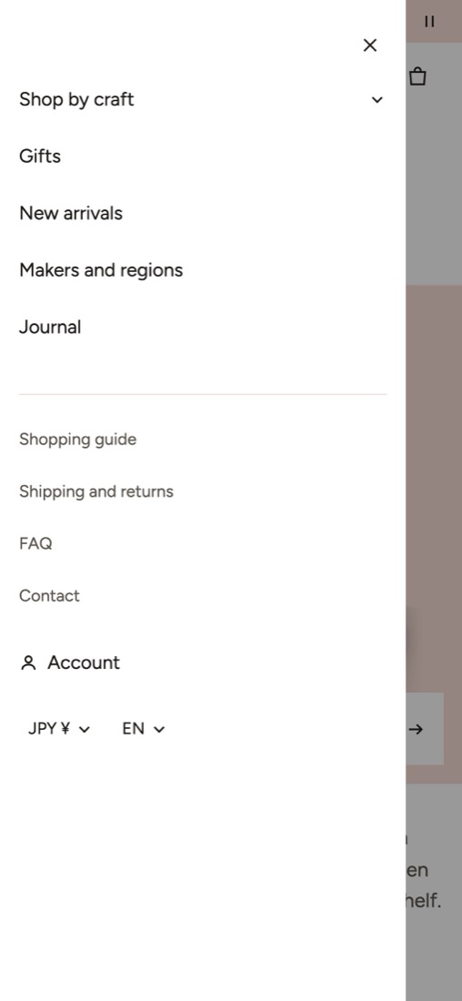
| Menu drawer | Always present. The mobile menu: Menu spacing (Compact, Regular, Spacious or Custom with exact top and bottom padding, side padding, item height 44 to 72 px, submenu indent and spacing), Drawer width (side drawer), which menu it shows, which side it opens from and which extras (secondary menu, account, country and language, social icons) it lists. |
| Chapter tabs | Always present, off by default. See the layout above. |
| Mega menu | Gives one main menu item a custom mega menu. Type the menu item's name exactly as it appears in Menu item, then choose Columns (Auto, 2 to 6), images and promotions. |
| Mega menu promotion | A picture card inside a mega menu: product or image, heading, text, link, Column span (1 or 2) and an optional countdown. |
| Menu label | A small label such as "New" next to a menu item. Type the menu item's name exactly. |
| Drawer promotions | Promotion cards at the bottom of the mobile menu. |
| Apps | A place for app blocks in the header. |
| Custom liquid | Your own code. See For developers. |
On phones the menu opens as a drawer from the side, with the secondary menu, the account link and the currency and language selectors under the main menu.
Account
Show account shows the sign-in and account button. It appears only when customer accounts are turned on in Settings > Customer accounts. To show Orders and Profile in the account panel, choose the customer account menu in Account menu.
Announcement bar
Up to six messages above the header (Kyoto installs with two: the free shipping progress and a shop news line).
- Display on desktop: Static list, Slide or Marquee. Display on mobile can differ.
- Each Announcement block has Content (Text or Free shipping), a link, an icon, an optional countdown, and under Show more settings a start and end date, the pages it shows on, the device and the audience (all, guests or logged-in customers).
- Text size: Small, Medium. Sticky behavior: None, Always, Desktop, Mobile.
- Show close button lets shoppers hide the bar; Stay closed for (days): 1 to 30.
- Text that does not fit: Wrap, or Move only when it does not fit.
- For Slide: Autoplay interval (3 to 10 seconds), Show arrows, Transition and Show progress line. For Marquee: Scroll speed (20 to 200 px per second), Scroll direction, Separator (None, Dot, Slash, Star) and Link speed to scrolling (only with Bold motion). Pause on hover and focus is on by default.
- Show country and language selectors adds the selectors to the bar on desktop.
Utility bar
A thin band for opening hours, a shipping cut-off or a phone number, with a menu, social icons and the country and language pickers. Add it to the Header area with Add section.
Campaign mode
For a sale or seasonal event with dates. Enter the Start date and time and End date and time once. Between them, Kyoto replaces one color scheme with your Campaign color scheme, can show a campaign bar with a countdown, can hide the announcement bar and can mark the products tagged campaign with a badge. After the end date the store returns to normal by itself. Use Preview in editor to see the campaign before it starts.
Footer
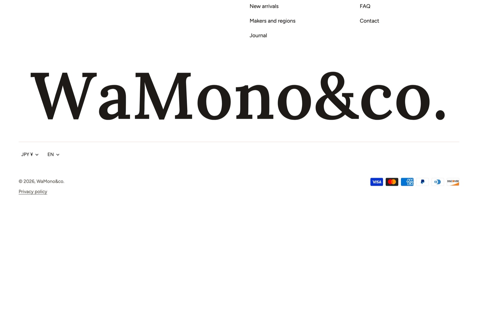
Kyoto installs with two menu columns, an email signup and a large shop name across the bottom.
| Setting | What it does |
|---|---|
| Show email signup | A signup band with its own Email signup heading, Email signup text and Signup consent note. Signups are saved as customers with email marketing consent in your Shopify admin. |
| Show social media icons | Uses the addresses in Theme settings > Social media. |
| Show payment icons | Shows the payment methods your store accepts. |
| Show country/region selector, Show language selector | Each picker appears only when your store offers more than one country or language. |
| Show policy links | Links to the policies in Settings > Policies. |
| Show Shop follow button | The Follow on Shop button. It appears only when the Follow on Shop feature is available for your store. |
| Layout | Columns, Centered, Split. |
| Collapse columns on mobile | Turns columns into tappable headings on phones. |
| Show back to top button | |
| Copyright text, Show Shopify attribution | Under Advanced > Show more settings. |
Footer blocks
Menu, Text, Image (width 40 to 400 px), Contact details, Logo (width 40 to 400 px), Payment icon (your own icon and label), Custom liquid, app blocks and Large shop name.
The Large shop name block sets your shop name across the bottom of the page: Size is a share of the screen width (6 to 30 %), Largest size caps it (60 to 480 px), with Letter spacing, Alignment, Color and Motion. A long name wraps between its words.
Mobile tab bar
Up to five tabs fixed to the bottom of the screen on phones and tablets, where thumbs reach easily. Add it to the Footer area with Add section. Each Tab has a Tap action (Link, Open search, Open menu, Cart, Account, Contents), an icon and a label. Tab labels: Below, Active tab only or None. The bar can hide while shoppers scroll down and on product pages, where the product page has its own sticky buy bar.